I spent October on building ASCII AUTOMATA, a cellular automata toy for visualizing textmode font connectivity, and developing a new UI approach using Hershey single-stroke vector fonts that stretch to fill any space.
In October after my teaching duties ended I could fully focus on the residency. And that focus yielded a new tool: ASCII AUTOMATA.
For some years I've been developing an ASCII art editor called MoebiusXBIN [1] which, among other things, supports custom fonts (besides the default IBM PC and AMIGA ones). Because of that, I've spent a lot of time in Aseprite and Fontraption[2] looking at pixels and thinking about what makes a good ASCII art font. I like fonts that have a diverse set of characters that "connect" to each other at the edges of their bounding boxes. Good examples include Amiga ASCII's Topaz fonts, and Commorode's PETSCII font. A font with characters that can connect to many other characters is good for creating ASCII art because they can be assembled into an endless variety of continuous and nearly seamless shapes, like logos, text, images and other graphics.
But, when making a new ASCII art font, it's pretty overwhelming and difficult to keep track of how everything connects to each other. If a character has an "edge connector" (part of a shape that touches one of the edges), but it doesn't have a counter part in some other character, it's less useful than a character that connects to many other characters. Knowing beforehand which character shapes end up being actually useful for drawing, and which ones end up rarely used, is largely guesswork, even with a strict design system. You can't really know unless you spend a lot of time making art with the font and getting really familiar with each of the 256 characters.
To ease this font-making process, I started designing a tool to analyze the visual connectivity of characters in textmode fonts. It works by scoring edge connectivity of each character and finding the best matching neighbour piece. With it, I can get a quicker sense which characters have a lot of matching counter pieces, and should (in theory) be useful for ASCII art purposes.
Then, to visualize which characters have the best connectivity, I made a sort-of cellular automata: starting from a random character, see if it touches an edge, and if so, place another matching character into its neighboring cell. Repeat until a dead-end is reached or a character with no additional edge connections is placed.
Because this tool produces unexpectedly beautiful and strange emergent patterns, I made it into a proper little toy-tool for anyone to play around with. It's available at https://hlnet.neocities.org/ascii-automata/. It was a great kickstart to my residency!
It was also a good opportunity for testing an idea I had for constructing a flexible semi-complex UI.
A little background. During the spring/summer, I got into researching single stroke vector fonts, specifically Hershey fonts [1]. They are a collection of vector fonts made in 1967 by Allen Hershey at the US Naval Weapons Laboratory. They were originally designed to be rendered using vectors on early cathode ray tube displays, but are still often used for carving text with CNC and laser cutting machines.
The neat thing about single stroke vector fonts is that they can be freely scaled, stretched, skewed or otherwise transformed while keeping the stroke contrast consistent. In other words, unlike with conventional outline based fonts, where any transformation applies to the whole shape, with single stroke fonts, transformations only affect the "skeleton" and stroke is applied afterwards, which keeps every stroke the same fixed width, and the overall visual consistency is maintained.
While working on new visuals with GRMMXI for Ruusut's upcoming album, we thought that this text rendering technique could be interesting to use, so I made a little web editor in which you can create type compositions using the Hershey shapes that fills the entire canvas regardless of word length. (Click the "Append" checkbox, then click the characters to see it in action)
For their gig at Flow festival, they asked us to do some visuals for it, so based on this web editor, I made a python script that generated an signed distance field (SDF) for each word in their song lyrics, which were then fed through some VJ software and timed in Ableton. I couldn't attend the gig myself to take proper pictures, so I don't have any, but this video by @danielapartanen from Instagram shows a glimpse:
I heard that there were some difficulties with the VJ software, so the end result is not exactly as we would have hoped, but even so, I think the results are pretty interesting.
Anyway, this got me thinking: what if you use this technique to render the text of UI elements, like buttons and labels? The problem with designing UI's is that they're often incredibly information dense, and trying to maintain denseness, ease of use, and ease of development while supporting all kinds of different screen sizes is a major headache. But if everything would just stretch to fill the screen space, I would only have to worry about different screen aspect ratios (desktop vs mobile), but not different screen/window sizes.
So, I made a web component which renders the Hershey vector shapes as SVG paths. The SVG fills the parent element, and applies stroke after the stretching happens (thanks to SVG's vector-effect="non-scaling-stroke"): so strings "A" and "AAA" take the same amount of space, while remaining legible because the stroke is independent of the text's transformations. Thus, I will never have problems with overflowing text in the UI again!
This works wonderfully with the layout system I've been developing, which is based on CSS grids. For example the sidebar is simply <div style="--cols:8;--rows:41;" class="sidebar grid"> and then each UI element gets a position and size <vec-text style="--x:1;--y:19;--w:2;--h:1;">Cell Width</vec-text>. As a result, the layout is easy to make beacuse all you really need to specify is the position and size for each element in the grid. The sidebar itself can be any size or shape, all the UI elements stay exactly where I put them, and all text remains legible due to the stretchy, monolined vector font web component. It's great! The only downside is that even 1px stroke can get muddy if the rendered text is tiny. But that is rarely a problem and can be worked around.
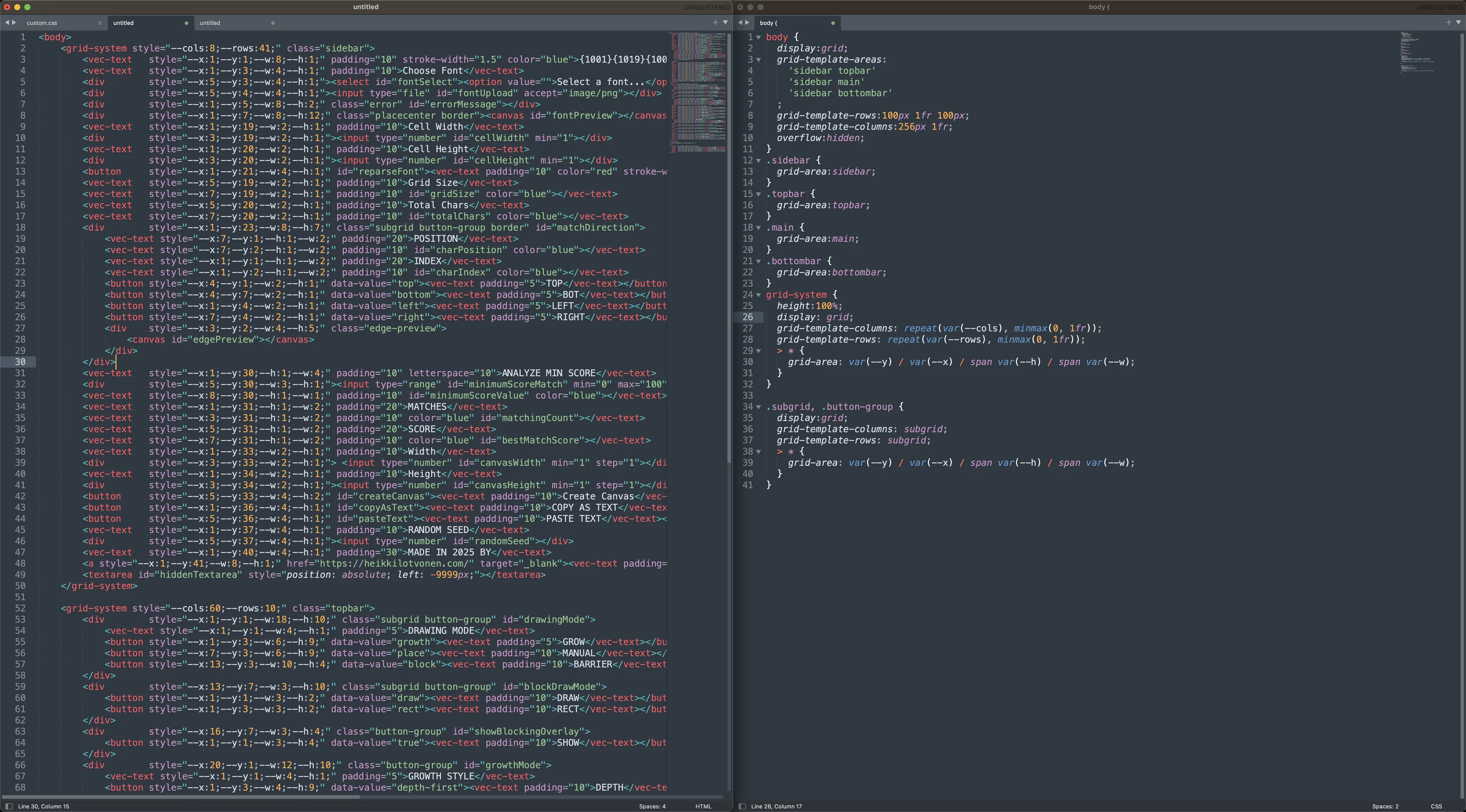
The WHOLE UI layout for ASCII AUTOMATA is just 120 lines of HTML, and 40 lines of CSS for around 90 UI elements, which is honestly pretty incredible! This technique has made UI design an actually pleasant activity, and one that doesn't fill me with dread anymore. (It did take a while to fiddle with the coordinate numbers, which was a bit painful, but I'm working on a WYSIWYG tool to make that easier too...)