I spent January on building Il-Verse, a spatial writing tool where characters are dropped in cardinal directions that collide based on lettershapes.
January produced yet another tool. The House of Text in Helsinki had a one month residency period for a group of artists working with text. They asked Arja if she could come introduce Centre for Text Margins, and they also wanted to hear more about my residency, so Arja invited me along. I had mentioned earlier that it would be really nice to collaborate with some artists who work with text to test out some new ideas I had for a poetry tool, so this was the perfect opportunity. The result is a visual poetry & experimental typography tool called Il–Verse, which I introduced to the group during one afternoon workshop.
It's based on the same kerning idea I already implemented for the single stroke vector font editor: fit glyphs as close to each other as possible based on the actual vector shape, so they're just about touching, but don't collide. Then add tracking.
But instead of automatically composing paragraphs from words, and words from letters, with Il-Verse you "drop" characters in a straight path (up, down, left or right) until it collides with another letter. It somewhat resembles manual letterpress typesetting, but as a writing tool rather than a design tool.
Before starting with the editor, I had to figure out how to make the collision system and get proper data to work with. I knew AABB [1] is computationally quite fast and simple to implement, so I went with that. Then I only had to figure out how to parse the letterforms into boxes. I remembered a method from Sebastian Lague's video on ray tracing [2] which mentioned a bounding volume hierarchy for subdividing a complex shape into smaller and smaller bounding boxes. I figured that would be the best, as it would produce the least amout of boxes, but with sufficient resolution (I also cull boxes that are not visible from one of the cardinal directions, because letters would only drop from those directions):
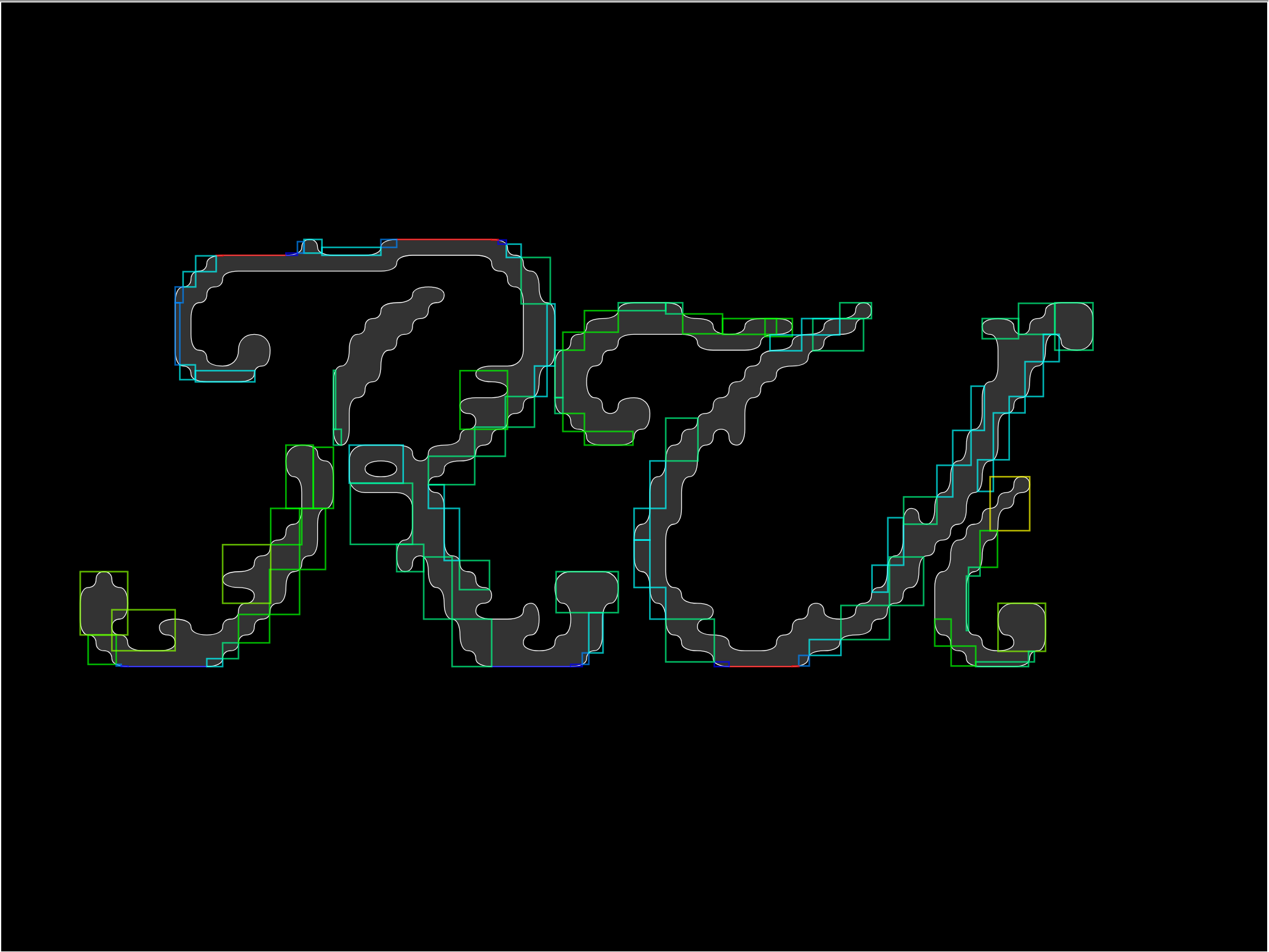
As mentioned earlier, this can create too much overlap in combinations like "C-" where the dash would go completely inside the C shape. I tried fixing this by adding a big bounding box that's some percentage of the original shape, and acts as a minimum bounding box size. This worked decently, so that combinations like AT, LY, etc. are not overkerned.
I used TypR.js [3] to get the font vector data, parsed each letter, then made a quick demo with matter.js [4]. The initial results were promising and fun! Almost too fun because I almost pivoted into making a kinetic typography sandbox rather than a poetry tool.
But as I started working on the editor, and had a friend try it, I realized that my initial approach was not going to work for two reasons: first, the binary tree method would produce zero width/height boxes where it found a straight edge, and this would cause all kinds of problems with the collision system, and second, my friend wanted to drop letters inside other letters! Like, drop some letters inside the bowls of the letter "B" for example. Which, I agreed, he should be able to do. But that didn't work with my method because the inner areas were either blocked by the inner bounding box, or because I had culled the inner bounding boxes and there was nothing to collide with. I had done the classic programming sin and optimized too early.
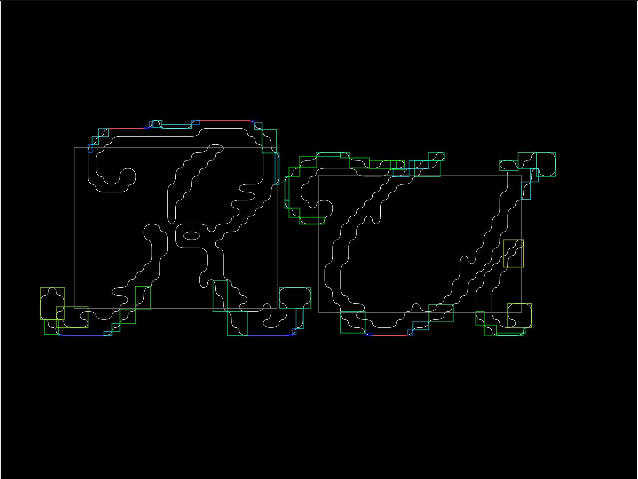
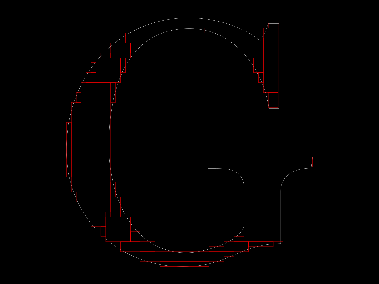
I had to figure out a different approach, and I settled on the following: rasterize the shape, divide it into 50×50 grid, find the largest axis-aligned rectangle inside the grid that the shape occupies, convert it to a bounding box, then repeat until some treshold is reached. This produced a decently low number of bounding boxes with a decent precision. I bet there are better and simpler ways to solve this problem. But this works just fine — I only need to parse the font once after all, and the larger amount of bounding boxes doesn't actually impact performance as much as I had feared. I can easily render 3000+ glyphs on one page, which is more than enough.
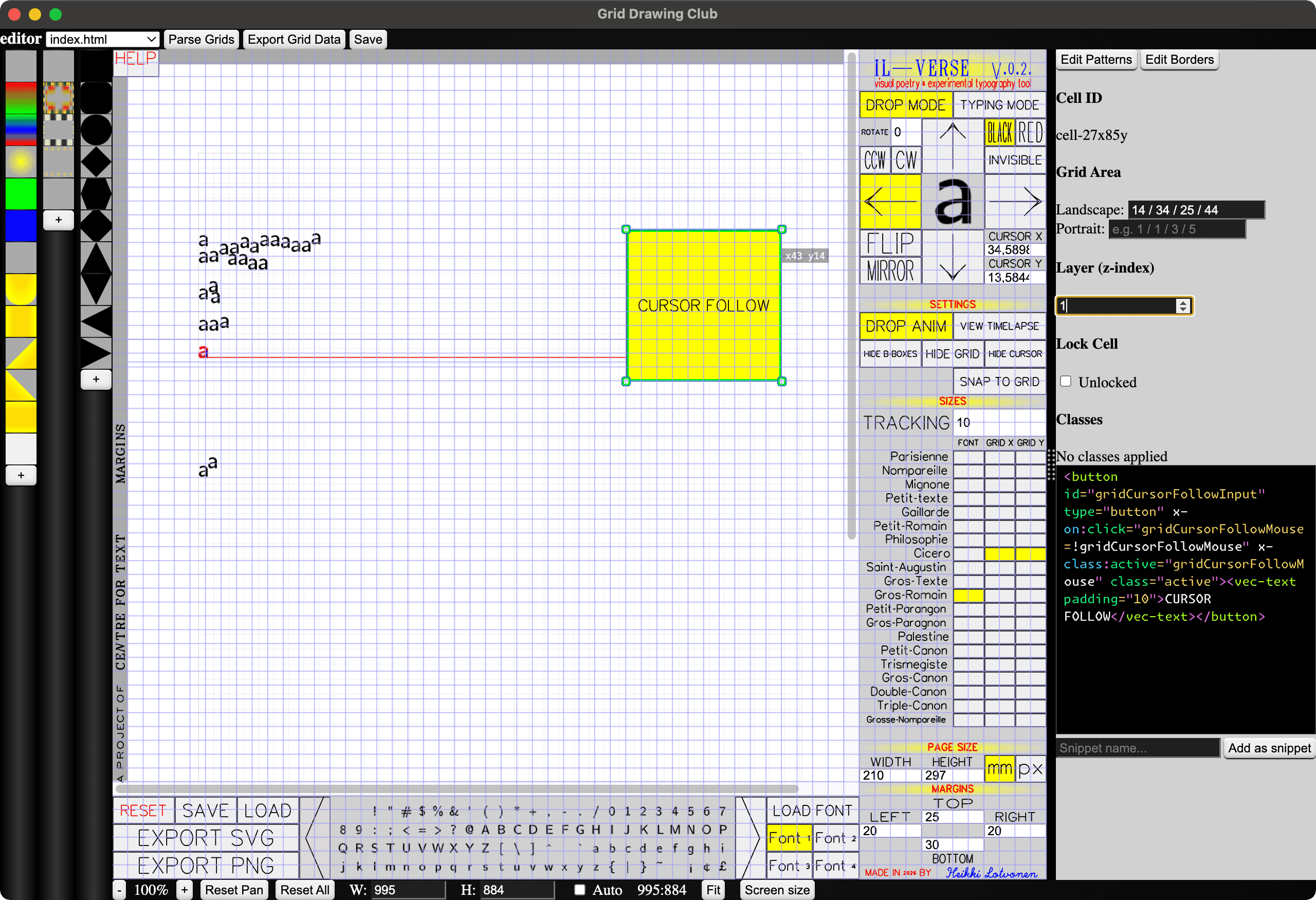
Then I did the rest of the editor. It has two modes: In TYPING MODE letters are dropped instantly on key press, and in DROP MODE letters can be placed more carefully with a mouse click. The drop direction can be changed, letters can be rotated and flipped, the font size follows Pierre-Simon Fournier's [5] type scale, and the editor is completely useable also with a keyboard. The cursor can be snapped to grid for precise lines. TAB places an empty bounding box at cursor location, which allows for creating all kinds of layouts. It saves the files as a command history, so the undo state is always preserved! It also functions as a nifty timelapse playback tool. You can load your own font, or use one of the four Computer Modern fonts. It's pretty simple but surprisinly "powerful".
Finally, I used the same UI system as with ASCII AUTOMATA, but with a new, refined and much faster workflow. I made it with an electron version of my Grid Drawing Club (which I also have been working on during the residency... I hope to turn into a kind of WYSIWYG hand-coding / grid layout / experimental HTML & CSS tool... hard to explain.) It's super fast. When making Il-Verse, I put all UI elements into a flat list of HTML elements (so almsot no nested elements). Then, I wrapped the whole thing into my CSS grid system, and wrapped each UI element into a <cell> (just a custom named element), and then I could drag and resize each element on the page, live. And it's JUST vanilla HTML and CSS, no build steps, no heavy libraries, no pain. I just hit save in my electron app and it's already there because all it does is edit the html file. Making the whole UI took me only one day, and I could have done it even faster if I had any kind of plan, but I went back and forth with positioning things here and there and trying many different layouts, which was easy and fast because of this workflow. It's so good! Can't wait to share this app with everyone. Here's a screenshot (it looks quite rought because it's in early stanges still, but it works!):
But, back to the workshop... the participants at the Text Laboratory workshop managed to produce many delightful works in just one afternoon:
I feel like I say this about all my recent projects, but I'm again overjoyed at the results, and very proud of the tool I made. It's also I think the perfect workshop tool because it's really fast to learn, it's somewhat familiar to everyone (whether you're more text or more image oriented), yet nobody is an expert at it so everyone starts at the same line, and everybody can produce some delightful stuff with it. And for those who really get into it, it can be a really great tool to explore a new spatial dimension of writing.
Almost forgot! I also got sick, stuck at home, so I made this water simulation in Godot using a bunch of compute shaders. Heavily based upon Sebastian Lague's fluid sim video, but with additional rigid body collision stuff. Plan is to turn this into a water physics based puzzle game, maybe, at some point. But I'll return to it at a later date, otherwise it might overtake my whole spring.
So far, it's very hypnotizing.
I'm about half way through my residency at the Centre for Text Margins and I feel like I've just started! But, looking back I realize I've already done quite a lot, which is nice. I'm very grateful for Arja for inviting me to be a resident, and grateful for Kone Foundation for funding it. It's been a dream to just focus on doing my things, developing tools, hosting workshops, exploring, experimenting and everything!
What's next:
And the rest is kind of unknown still. I will figure things out though. Here's a list of maybes (not promises):