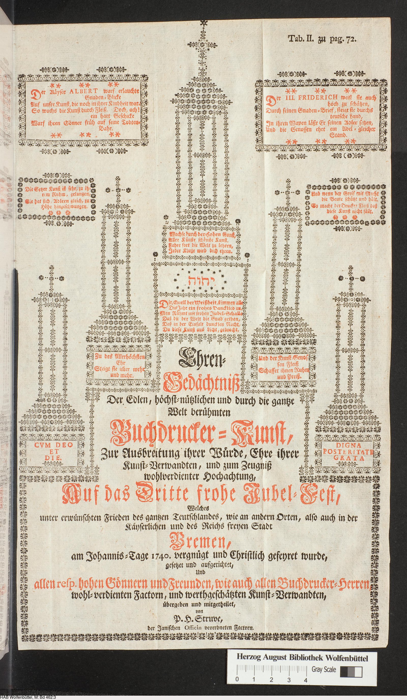
"As flower-borders will sweeten the sight and smell of your garden, so may borders of flowers gladden your pages."— Francis Meynell, 1920
While Adel was here, we worked on Heikki's Garden of Flowers. He made the first version of this site already about a year ago after I had sent him my image collection. That version was quite barebones though, so now that he was here visiting, we thought we'd make it a proper one, something that could be shared around. So, at the end of May, we spent a few days at my studio hammering it away; Adel on the PHP and me on the CSS. I'm very grateful for Adel for putting it together!
I spent the first two weeks of June on cleaning up the archive, fixing some CSS stuff, and writing this essay, which is a brief account on how it came to be, and why it exists... (this essay also is on the webpage)
In 2015 I wrote my BA thesis on Amiga ASCII art, a form of text-based art in which images are assembled from letters and other characters arranged on a uniform grid, set in the Amiga's Topaz font. As part of my research, I was curious about the history of ASCII art but found very little on text art that came before it. Most sources treat typewriter art and calligrammes as the precursors (as did I in my thesis) but mention letterpress and movable type only briefly (if at all).
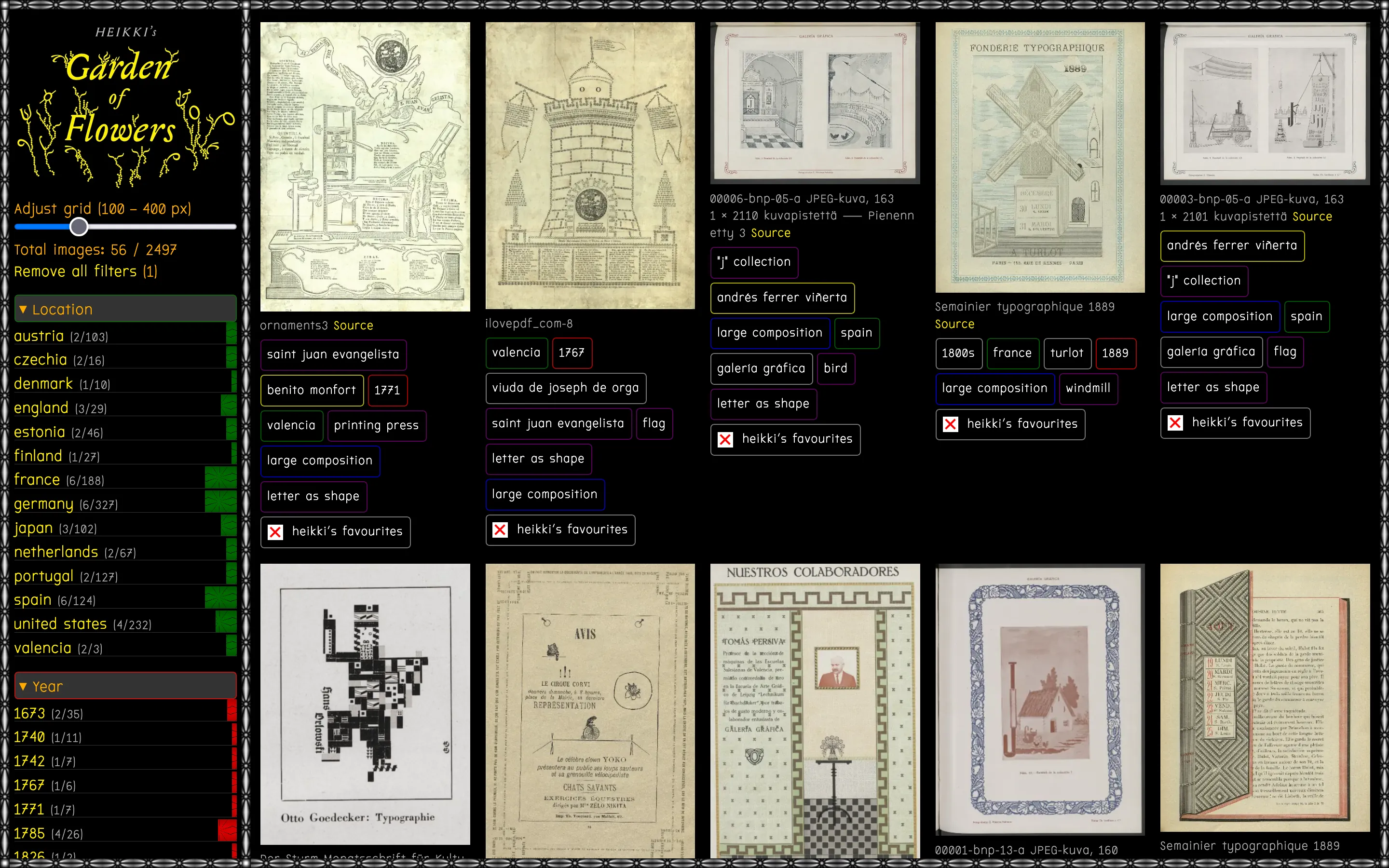
But then I came across1 Analog ASCII, a blog post by Jordan Goffin, which showcases three amazing examples of ASCII-like pictorial typography, all made with letterpress in the 1700s. This one from Bremen, Germany, made in 1740:
And these two from Valencia, Spain, made in 1767 and 1771:
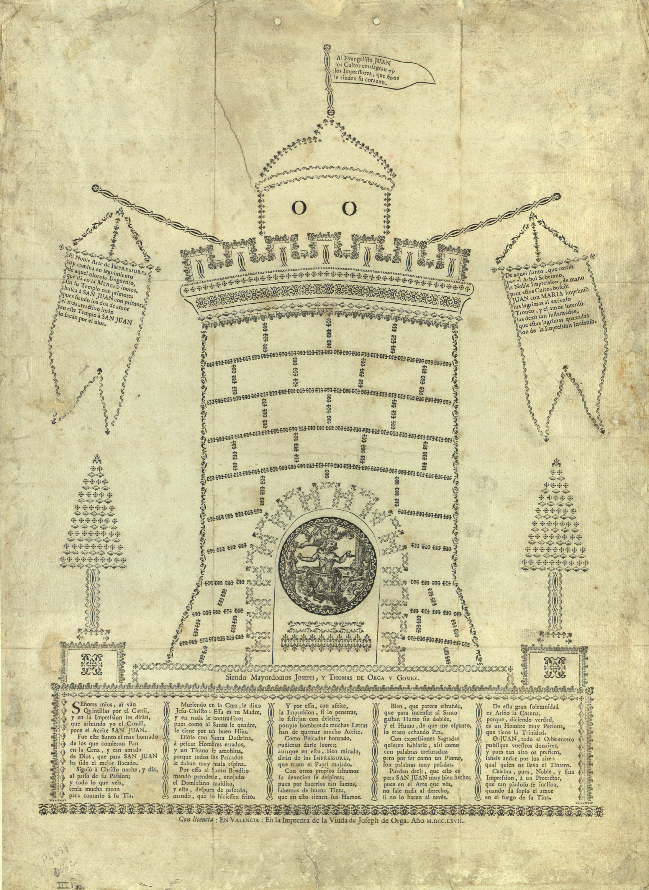
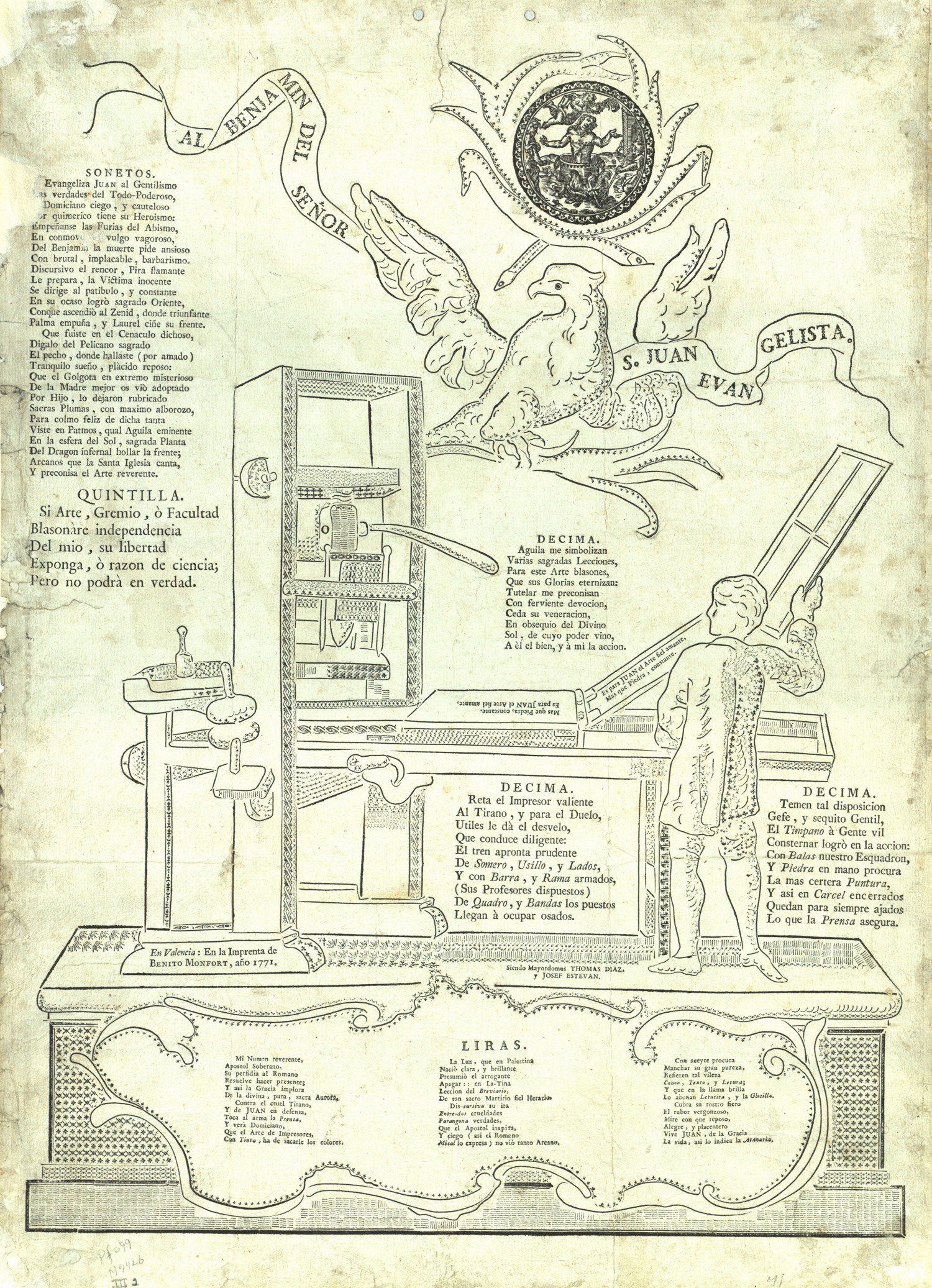
When I discovered these images, they puzzled me because they are real feats of typographical ingenuity and skill, but I had never seen anything like them before. Like ASCII art, the images are composed entirely of typographical elements: characters, ornaments, and rule, each a tiny piece of metal type. I had seen type ornaments used as decorations for title pages, page borders and small embellishments, but never as modular building blocks for constructing elaborate images.
Goffin's blog post also mentions a book on the history of Valencian printing, Reseña histórica en forma de diccionario de las imprentas que han existido en Valencia… (1898). Browsing through the book, another peculiar image, made sometime in the 1870s by Andrés Ferrer, stopped me in my tracks:
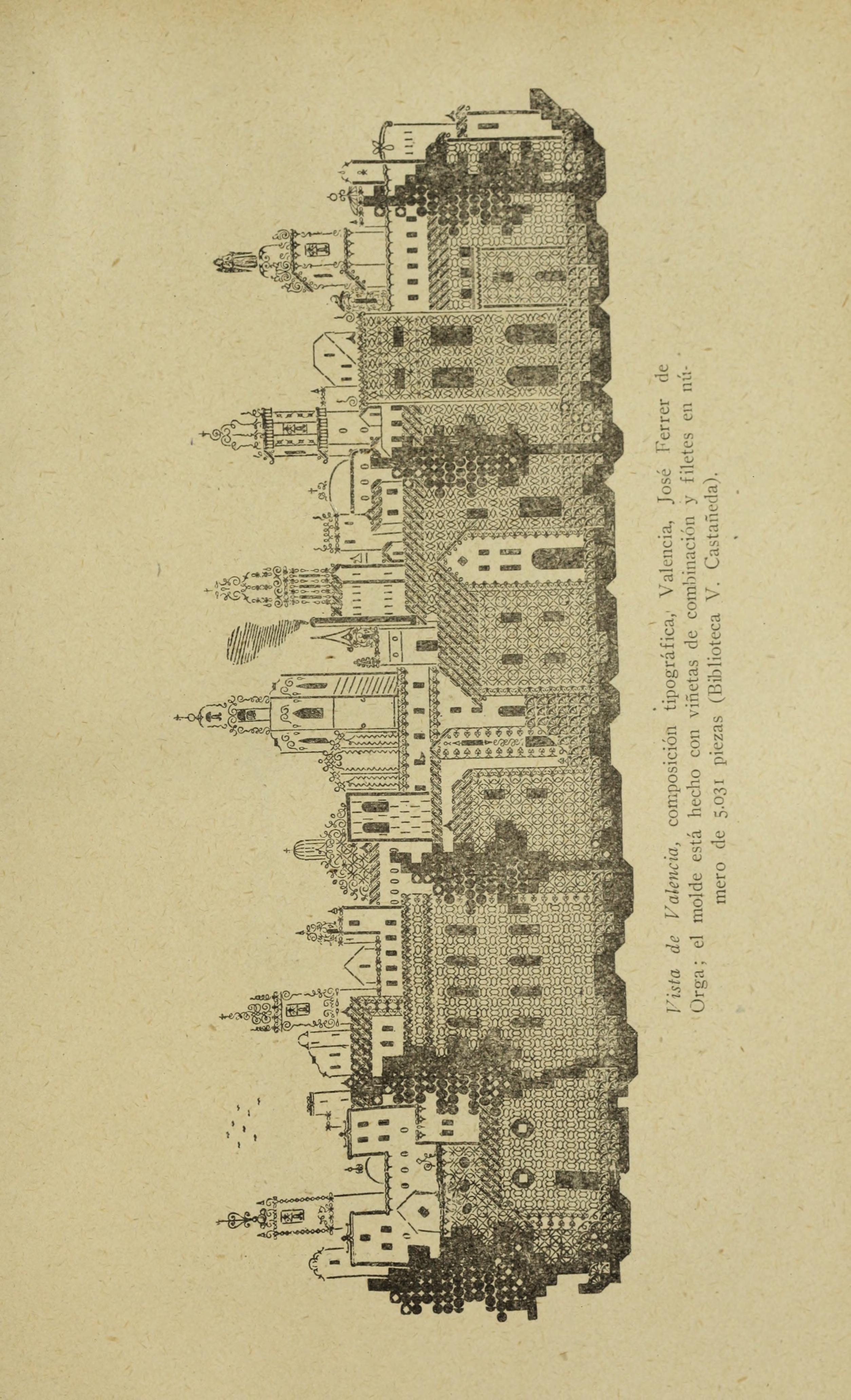
I was mesmerized. This Vista de Valencia, composed of 5031 individual pieces of type, has a distinctly digital quality to it. It's made almost 100 years before the advent of ASCII art, but the image's construction, the trees in particular, bear an uncanny resemblance to the semigraphic style of Commodore PETSCII art. To me, it is ASCII art before ASCII art in its purest essence: the page, its image built from a limited set of typographical units, becomes a stage for curious and intellectually stimulating play, a metatypographical puzzle that is marginal to language yet deeply and silently human.
After finding these images, I became obsessed: I wanted to find more images like them. To me their existance suggested that there might be an alternative, or complementary history for text art that was perhaps overlooked, one that wasn't limited to typewriter art or shaped poetry. Because if four people had, in different countries, cultures and timeperiods, arrived at something so similar (Germany in 1740, Spain in 1767, 1771 and ~1870), then surely these weren't isolated one-offs. And because all three prints were already what I would consider masterworks, there must exist some kind of prior experimentation also. There had to be more, I just had to find them.
But as I started searching, I realized that this kind of information isn't readily available anywhere. There's nothing substantial or comprehensive written about this practice in any book or website I've found; only bits and pieces here and there. So, I started searching for information, and collecting every letterpress work I could find that had a distinctly visual quality to it, pictorial or abstract, and saving everything to a personal database. Bit by bit, as I found the relevant keywords (type picture, typosignet, typotecture, bildsatz, stigmatypie, stunt typography, pictorial typography, art-printing, just to name a few), I started to uncover a deep, centuries-long, cross-cultural practices of ASCII-like text art.
After roughly 8 years of scouring various digital collections2, I've amassed over 2500 images (as of 2026). After showing the collection to a friend and fellow ASCII artist Adel Faure, he developed this site, for which I'm eternally grateful, so the collection can now be browsed by anyone, in its entirety, on this site (garden-of-flowers.heikkilotvonen.com).
While Heikki's Garden of Flowers aims to be a comprehensive catalogue of historical and contemporary pictorial letterpress works, the work is ongoing and incomplete. There's still so much to find, connections to make, forgotten stories and overlooked histories to be told, many beautiful works that deserve to be seen. But why has this art form been so overlooked? I'm still formulating an answer to that, but I think a good place to start is asking a slightly different question: why were these works made in the first place?
Let's look at an example. According to Albert Schiller, this type picture he made in 1939 required "one hundred hours of planning and one hundred hours of work in the shop":
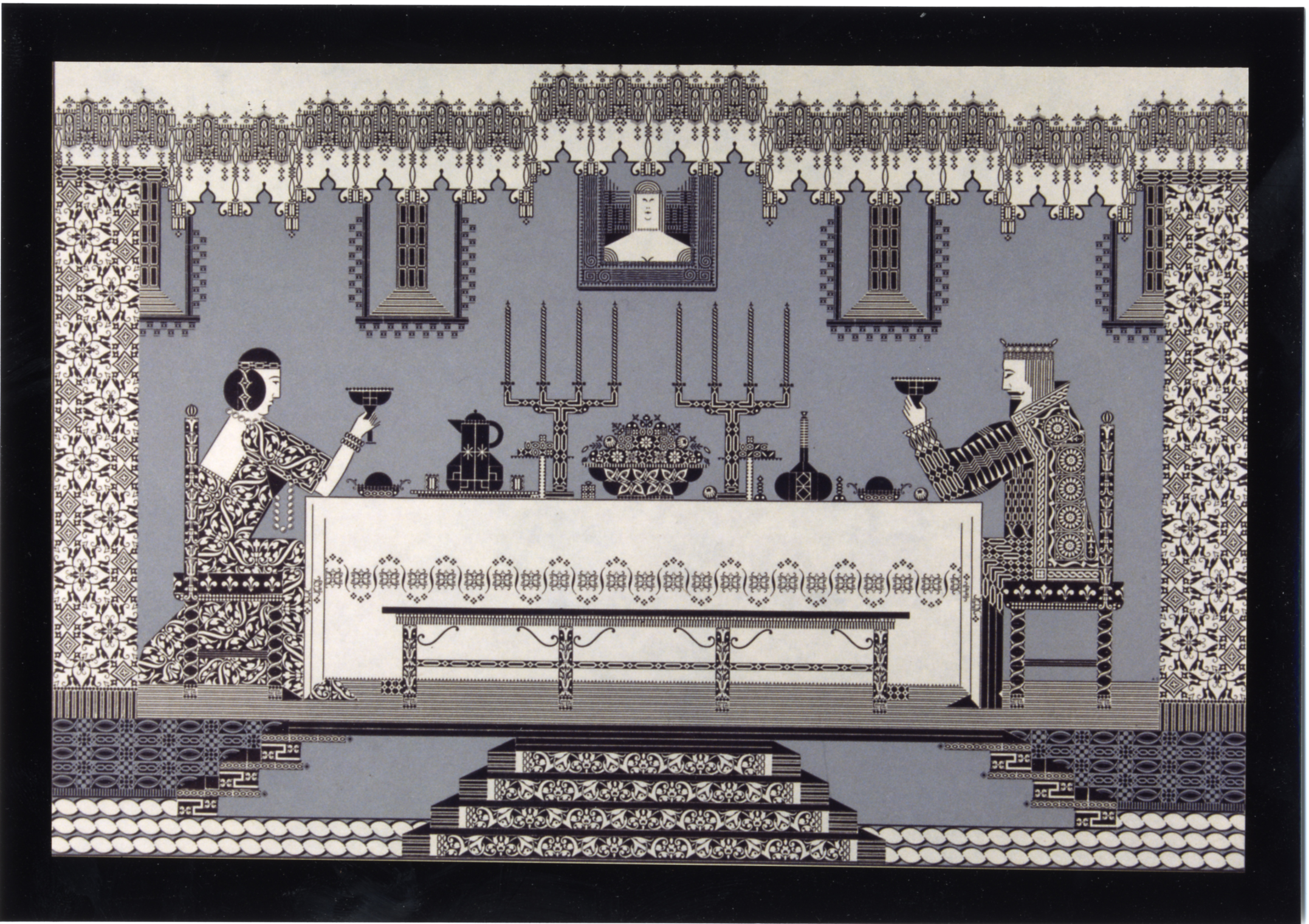
What drove someone like Schiller to spend hundreds of hours constructing images like these?
Or, what drove Andrés Ferrer (who made the Vista de Valencia) to spend months, if not years, making (allegedly) one-hundred-and-fifty pictures like these, using just the letter "J"?
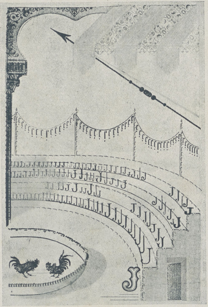
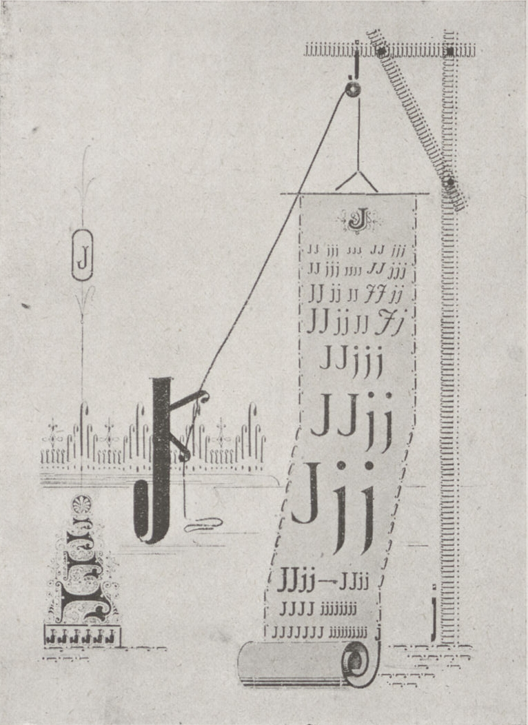
I can't speak for either of them, but I think it has something to do with a particular feeling of profound joy and pride that is really difficult to put into words. Quoting Schiller's contemporary, Frederic Warde: "The fascination of experimenting with combining, reversing, spacing-out and alternating the simplest unit is indescribable."
However, having spent hundreds of hours drawing ASCII and making these kinds of image assemblies myself, I can try to explain what it means to me: it's all about the process of arranging, then rearranging, inverting, adding and eliminating type elements in hundreds of different ways, all without even remotely exhausting the range of possiblities their combinations can make. I can't draw freehand, but I can construct images. But, I can't really know beforehand what, or how I'm going to construct something either, because the process itself is completely dependant on serendipitious experimentation. The material qualities of both ASCII art and letterpress type pictures regulates the design process, and channels the picture to conform to the medium's idiosyncrasies. The image, piece by piece, comes into being, almost as if I hadn't just made it myself. I can discover shapes and images I couldn't even imagine making. It's fascinating and pleasing to release the latent potential of simple, unassuming lettershapes and type ornaments, when combined, into something completely unexpected.
And then there's the occasional happenchance of figuring out the perfect piece to represent something. In 1673, Georg Wolffger made this image:
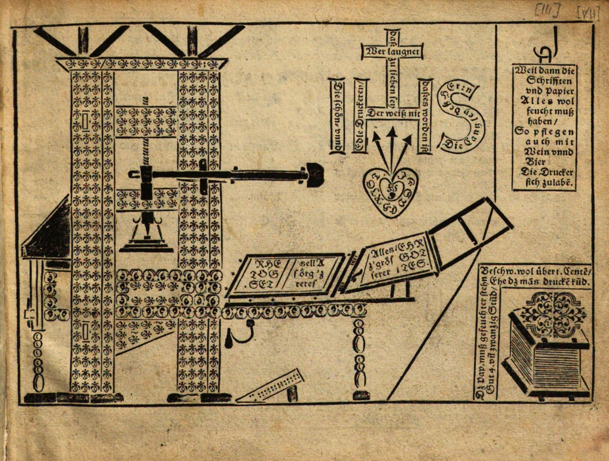
Look at the top left: I can only imagine the excitement and joy when he realized that the italic letter "m", when rotated 90 degrees, can represent the threads of the press' spindle.
But sadly, the beauty of the art doesn't translate well to those who are not familiar with the technique. The response has been almost always dismissive ("tasteless", "unprofitable", "wasted effort", "stunt", "nothing to do with art", "ingenious, but also decidedly ugly"). This sentiment was also felt by Albert Schiller, who is perhaps the only person (pre-ASCII times) who openly proclamed himself as an "artist painting with type". He wrote a manuscript in 1941-42 titled Artist In Space: The Strange American Phenomenon of the Wonderful Pictures. It was an attempt at justifying type pictures as a new form of art, and himself as an artist:
"Who can be so much a hypocrite as to decry as being 'in bad taste' or 'unfortunate' this outpouring of mine, this single lantern raised against a very blackout of mind, an indifference to the true importance of my type pictures, an indifference as colossal as they are great? […] What if I refuse to wait the prescribed 150 years until some custodian now unborn lifts out of obscurity and 'discovers' a musty file of my beloved prints?"
I think I understand Schiller's frustration. He desperately wanted others to see the beauty in his art. But, because it is indescribable, as Warde put it, it is also inexplicable, its lure cannot be exaplained to others in words. In trying to do so anyway, Schiller came off as too pompous and entitled; he had sent the manuscript to a publisher, but it came back with the following note:
"Mr. Schiller's refusal to wait five hundred years for acclaim and his desire to take his type pictures directly to the people are understandable and commendable. But, in the last analysis, it is what the people think of his work that will determine whether or not it endures. The type pictures must speak for themselves."
Today Schiller is known mainly to letterpress enthusiasts, but not really outside of that. He never really got the acclaim that he wanted. But the unborn custodian is, more or less, what my archive aims to be, not just for Schiller, but for all the letterpress artists who have been dismissed throughtout the ages. And I think the publisher's reader was right, instead of trying to over-explain the importance of these pictures, I think the type pictures must speak for themselves: I hope this archive can be the space where they can do so, not as single entities but as a collection that is more than the sum of its parts. And as such, I hope the archive will also function a springboard for further research into the works, people, and cultural phenomena behind them, so they finally get the recognition they deserve.