On building a letterpress simulator that reverse-engineers metal type bodies from old specimen scans, and a modular vector editor where shapes snap together along growth points – including a family of 3–4–5 arc modules that stay perfectly on the grid.
I thought that Polyarc Draw (see July entry) would have been the last editor I do during this residency... but no, I started working on three more: a letterpress simulator, a modular vector editor and an experimental calligraphy app with nib rotations. The last one is still a very raw demo, so I'll skip talking about it for now and focus on the first two.
I've long wanted to make a letterpress simulator where I could make compositions, in type size, using scans of old specimens. Typographica Library has a wonderful list to hundreds of such specimens, and in recent years, some of the scans are in good enough resolution for this kind of idea to work.
Thus, I started working creating an editor where I can create digital layouts with cut-outs from old scanned type specimens, all in type size so the images could be recreated with real type on real letterpress! It supports all point sizes and shapes, so it's not restricted to just square shapes.
The tool is still work-in-progress, but here's a screenshot of its current state. It works, but lacks many features and a proper UI:
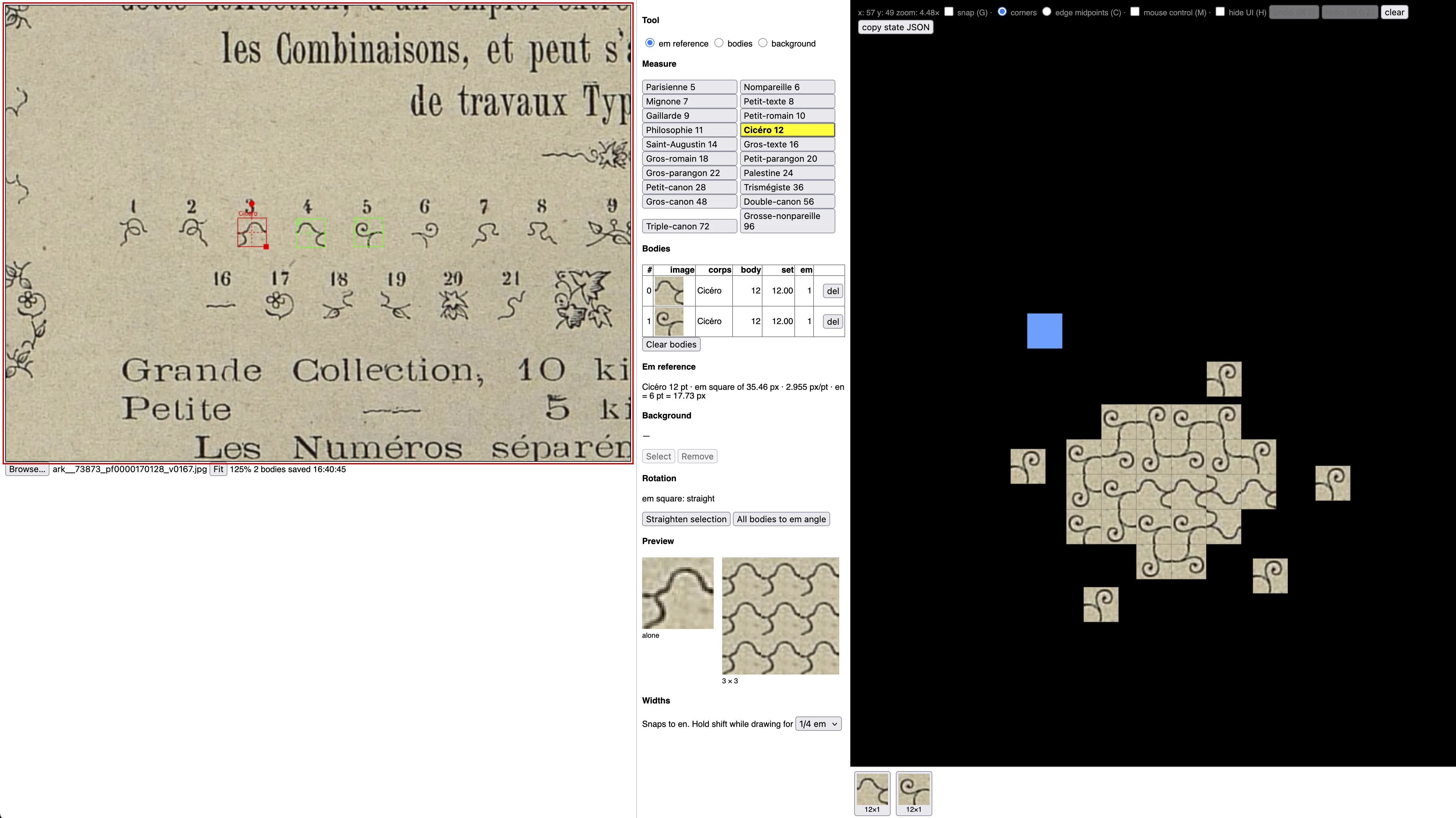
The editor is divided in two: on the left side, you define the type bodies and on the right side you compose with them.
Before I get into the details here's a little video of it in action. This image is made with ornaments from the 1880 Fonderie typographique Gustave Mayeur type specimen, using type ornament I call "ivy combination".
This editor had two major problems I had to solve. They are actually both related to the same root problem, which has to do with type bodies. Each metal type has a "body", a solid rectangular metal (or wood) block that carries the raised letter character (the face). When printed, this body is of course invisible, but the bodies are very important for many reasons: they include the spacing around letters, and acts as a physical boundary for how the type can be set against each other. The sizes of the type bodies follow a strict, modular point system so that the combined width & height of the type bodies fit the measure exactly. But, the printed specimens show only the (type) faces, not the type bodies, so the first problem is figuring out a system to reverse-engineer the bodies from the printed specimens. The second problem is figuring out how to actually set the type – in two dimensions – when the type bodies are both highly regular and varied.
To solve this problem, I can use two clues to help me figure out the system: most specimens actually tell what the body size for each type is, and both height and the width of the type follows the point system. So, if I can figure out even one body size correctly, all of the other sizes are relative to that.
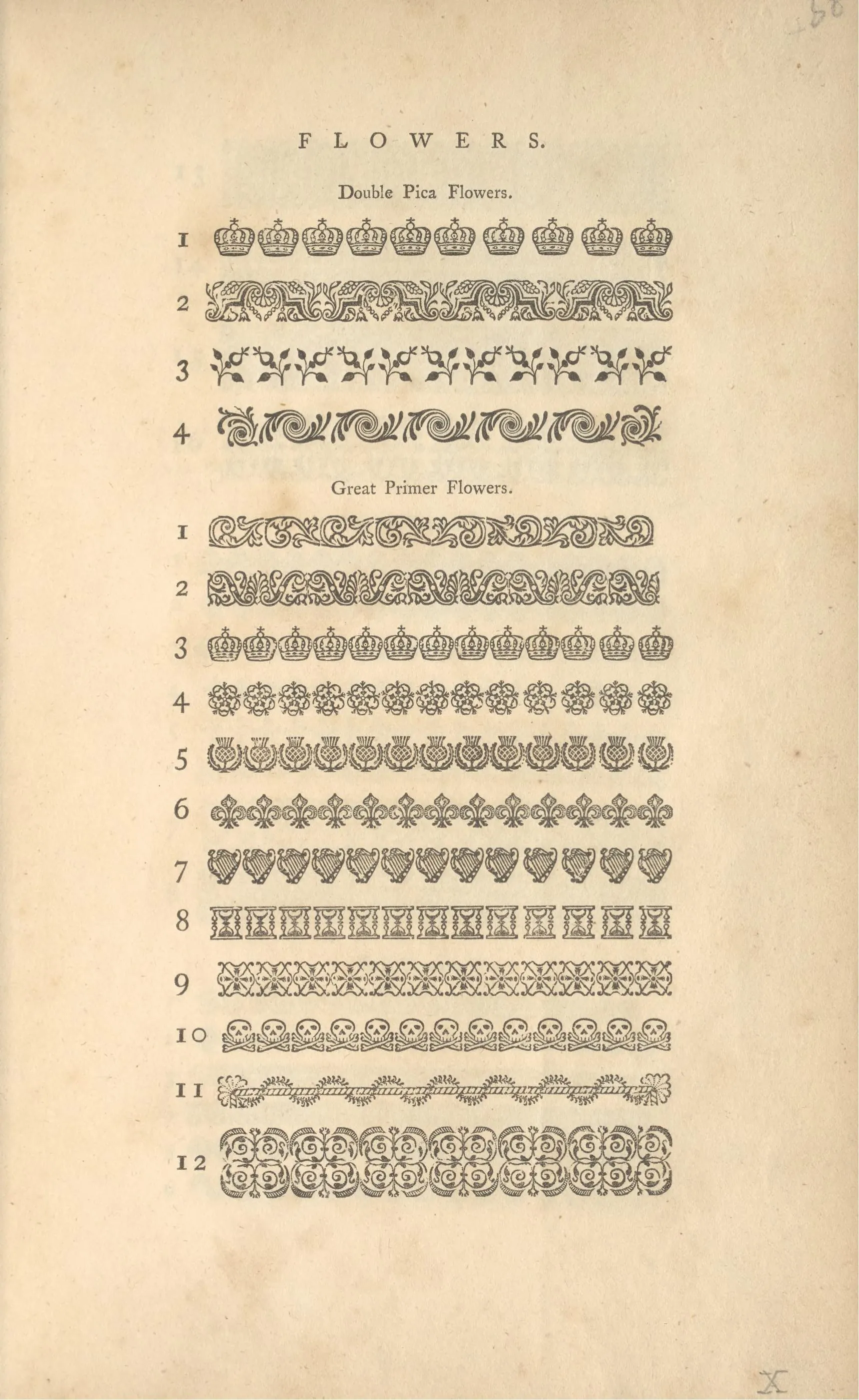
For example, the following specimen page from William Caslon's 1785 specimen tells me that the ornaments on this page are on Double Pica and Great Primer bodies. Wikipedia has a listing of most traditional point-size names, which gives Double Pica a size of ~ 9 mm and Great Primer ~ 6.75 mm. It also looks like the shapes are meant to hug the edge of the type body (so they can be combined in a border), so by drawing a square box around one of the shapes and using it as an em reference, I can then cross-reference it with the other point sizes from the Wikipedia list and get the rest of the type sizes in their correct aspect ratios. The point system is quite amazing: for example, if I were to use two Great Primer ornaments next to each other, the combined width is 13.5 mm. If I wanted to match that measure, I could use one Double Pica (9 mm) and one Pica (4,5 mm + 9 mm = 13.5 mm), or three Pica ornaments (3 × 4,5 mm = 13,5 mm).
The first one to come up with this kind of point system, Pierre Simon Fournier's 1764 Manuel typographique, shows these proportions nicely (Cicéro [12pt] is two Nompareilles [2 × 6pt] or Mignone + Parisienne [7pt + 5pt]):
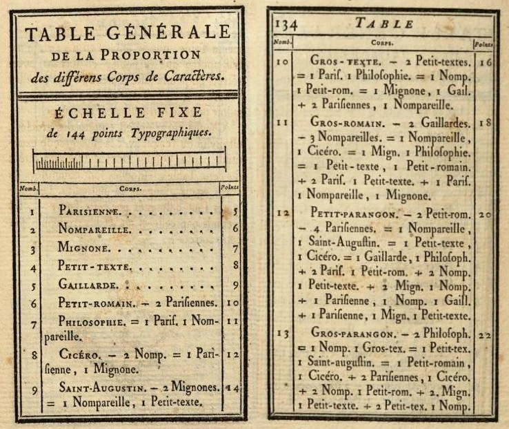
Note that the actual point or millimeter size doesn't really matter to me, only the proportions!
So, I can load an image like the ivy combination, draw a Cicéro square around the first ornament (number 3) by guesstimating where it goes (it's a combination ornament, so the branches probably go to the corners / middle of the body), and then draw a Cicéro body, which gets its size from the reference, around all the other shapes. Note how the ornament #9 is wider than the others: when I drag the box around it, it's exactly 2 em's wide. And the bigger unnumbered ornament is based on Palestine (24pt, or two Cicéros).
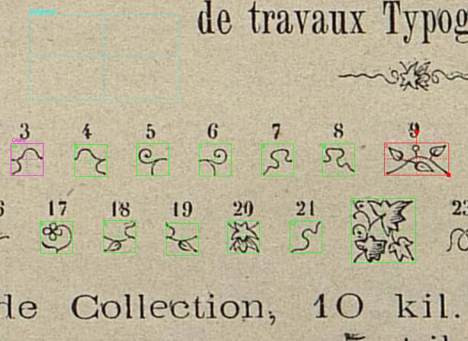
As body boxes are set, they become available to use in the composing side (technically, its just a list of bounding boxes & cut-up textures). Testing them, I can see that all of the shapes combine nicely with each other. The system works!
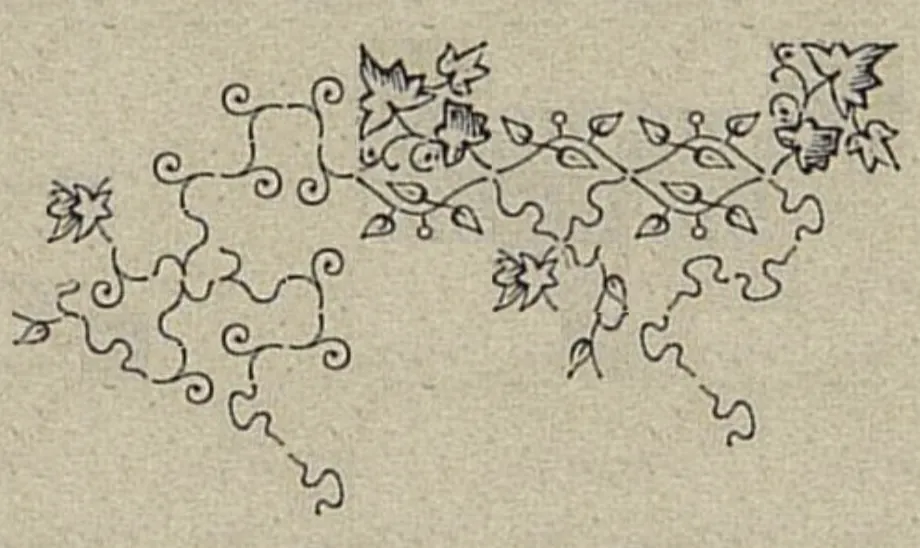
There are some slight gaps between the ornaments, which I could try to eliminate by more careful body positioning and em reference sizing, but looking closer at the specimen page, the gaps are present in the original compositions too.
How to use these bodies? I'm used to relying on some kind of square grid to use for snapping the pieces, but that won't do here because they type sizes are so varied. I first started with a collision based typesetting:
You can move the current body with arrow keys and it collides with already placed ones. Holding shift disables the collision for a moment (displayed with lower opacity), and moving when overlapping finds the closest available space in the direction moved. It's kind of like moving a player character in a top-down game. Pressing S stamps the current body, R rotates, F flips. It works well and is closest to how it works in real life (you use your hand to slide the pieces in place against other type, furniture or composing stick etc.). You can also toggle a mouse mode, which makes the piece follow the mouse.
But this posed a problem: it's not very precise. For example, I want to be able to snap the pieces by their conrers or midpoints... so I added that as another mode for adding pieces.
I added a "probe", the red circle, and it casts a ray to the closest corner of the placed pieces (that has available space). The selected piece then snaps to that position (according to its closest corner). Pressing C switches this to aim at the edge midpoints instead. The piece still snaps by its own corners, so the pieces can then be offset by exactly half – common technique in handset type. The rest is the same: S to stamp, R to rotate. The probe can be moved with either arrow keys or the mouse. This feature turned out to be super fun and inspiring. It makes making precise but complex combinations very easy and joyful.
This snapping feature turned out to be so fun actually that I had to try another idea I had been brewing for years... more on that below.
I think I'll continue developing this tool later. My plan is to go to Aalto's letterpress studio, make a print with each ornament they have, scan it, then feed that into my program, with the goal of using this tool to make complex ornament composition blueprints, then go back to the letterpress studio to recreate it from the blueprint. It should cut the time I need for making real, complex letterpress type pictures by a lot, and make more ambitious compositions possible. I'll make it available online when it's done.
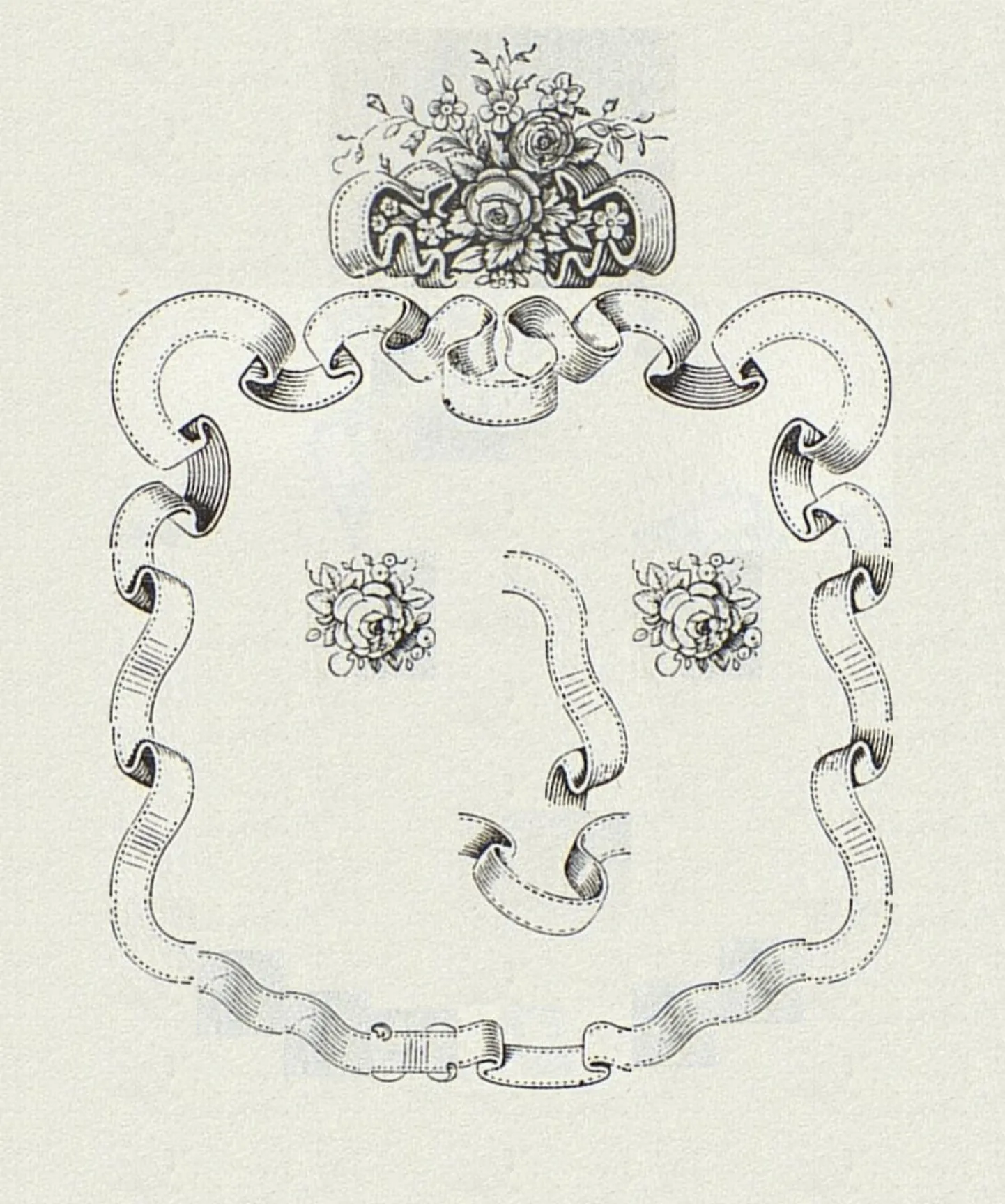
Once I got the snapping feature working in the letterpress simulator, I realized that I could finally do what I've wanted to do for a looong time: something like Glyph Drawing Club but with the possibility of making my own shapes IN the editor. And as an added bonus, make it based on "growth" points, rather than (only) a square grid.
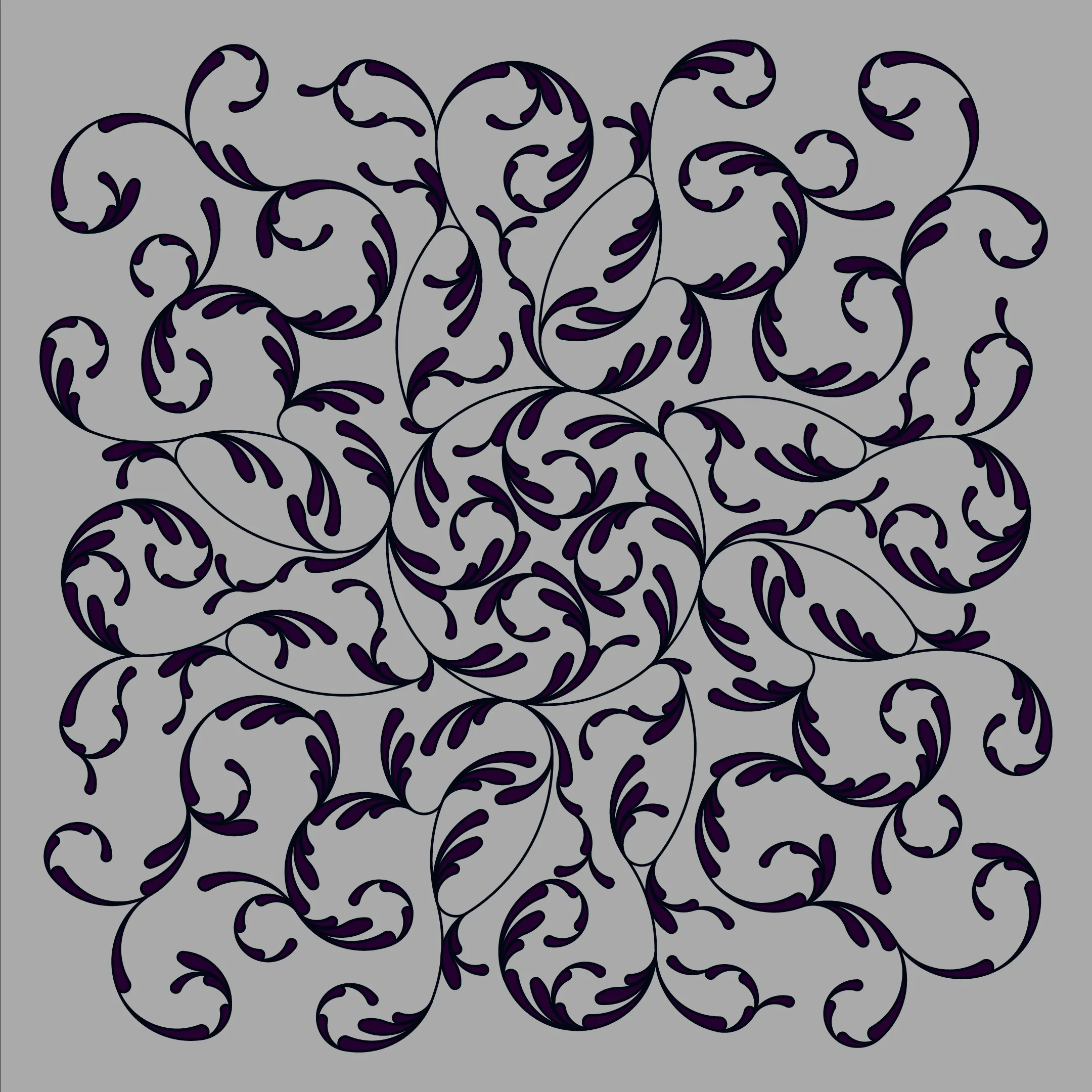
Here's one of the first things I made with it, showing nicely its rather exciting potential:
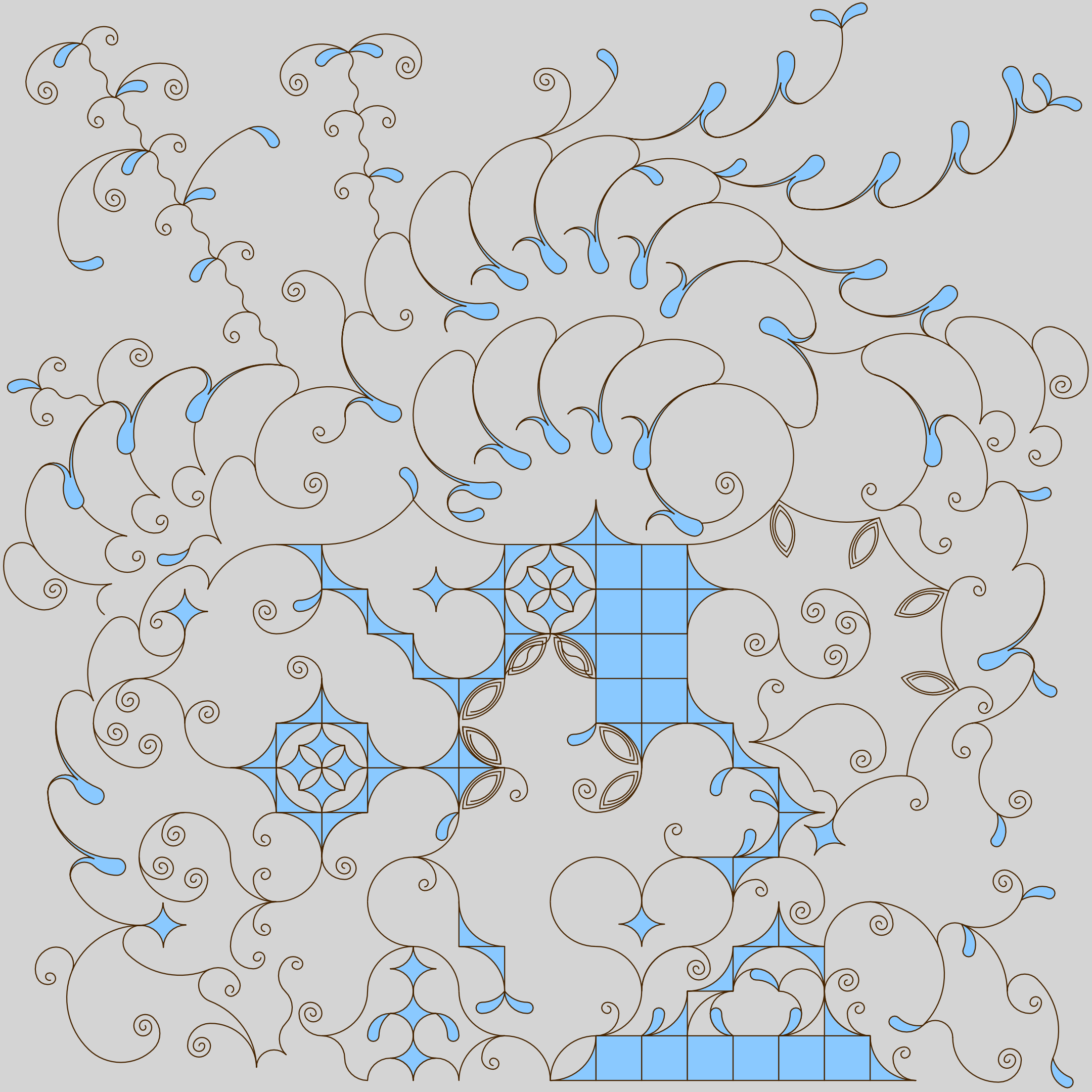
In short, the (still untitled) editor is also split in two: drawing and composing. In the drawing mode, it's basically the same as Polyarc Draw, with the difference that I can attach "growth points" at anchors that then is used to snap shapes together following the growth point's tangent direction. If any of the drawn points are on the major grid lines, they automatically get a growth point. Otherwise, they can be added and toggled on & off.
I also got obsessed by these two shapes / modules:
I had already drawn these exact shapes to my notebook in 2023, thinking they had some nice properties on a square grid, but only now with my program I could finally test what those properties are.
So, the question I had: On a square grid, if I draw a pie slice whose centre is a grid point and whose radius reaches a grid point, which slices have both endpoints on grid intersections? The four quadrants obviously, but what else?
The answer can be found with Pythagorean triangles. Pythagorean triangle is a right-angled triangle with each side and the hypotenuse being an integer number. The smallest such number is a triple 3–4–5, or 32 + 42 = 52.
The neat thing is, because the hypotenuse of the above triangle is exactly 5, if we use that as an arc radius, the two shapes that form around the 3–4–5 triangle are also perfectly on the square grid because, again, the radius is an integer!
I don't know how to call these asymmetric unequal-sagitta arc-to-corner modules, but they are special: they are 3x1 and 4x2 cells in size, but combined form a perfect circle.
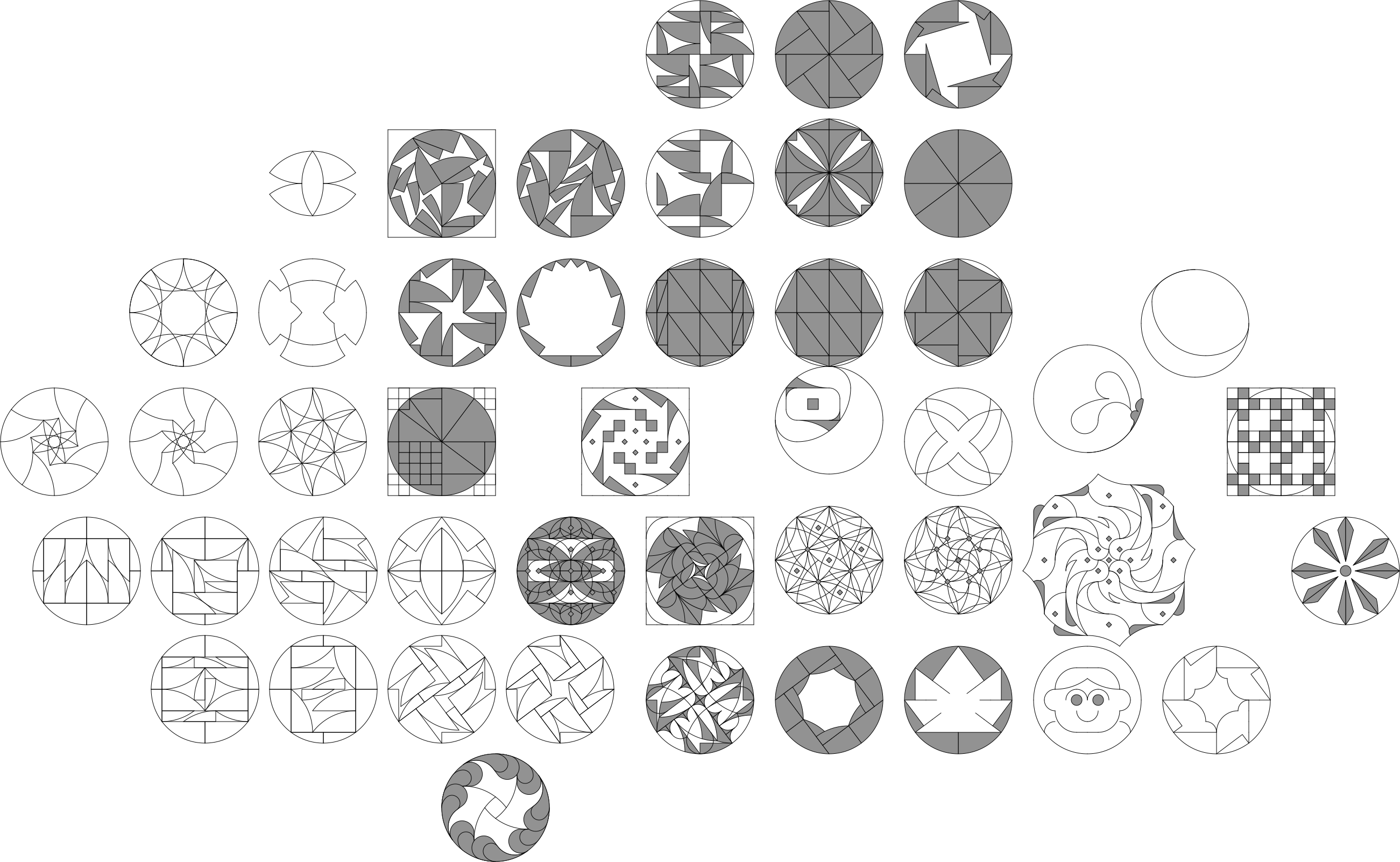
And when continued, rotated, flipped and combined with other shapes, the combinations get pretty crazy, while still being on the grid!
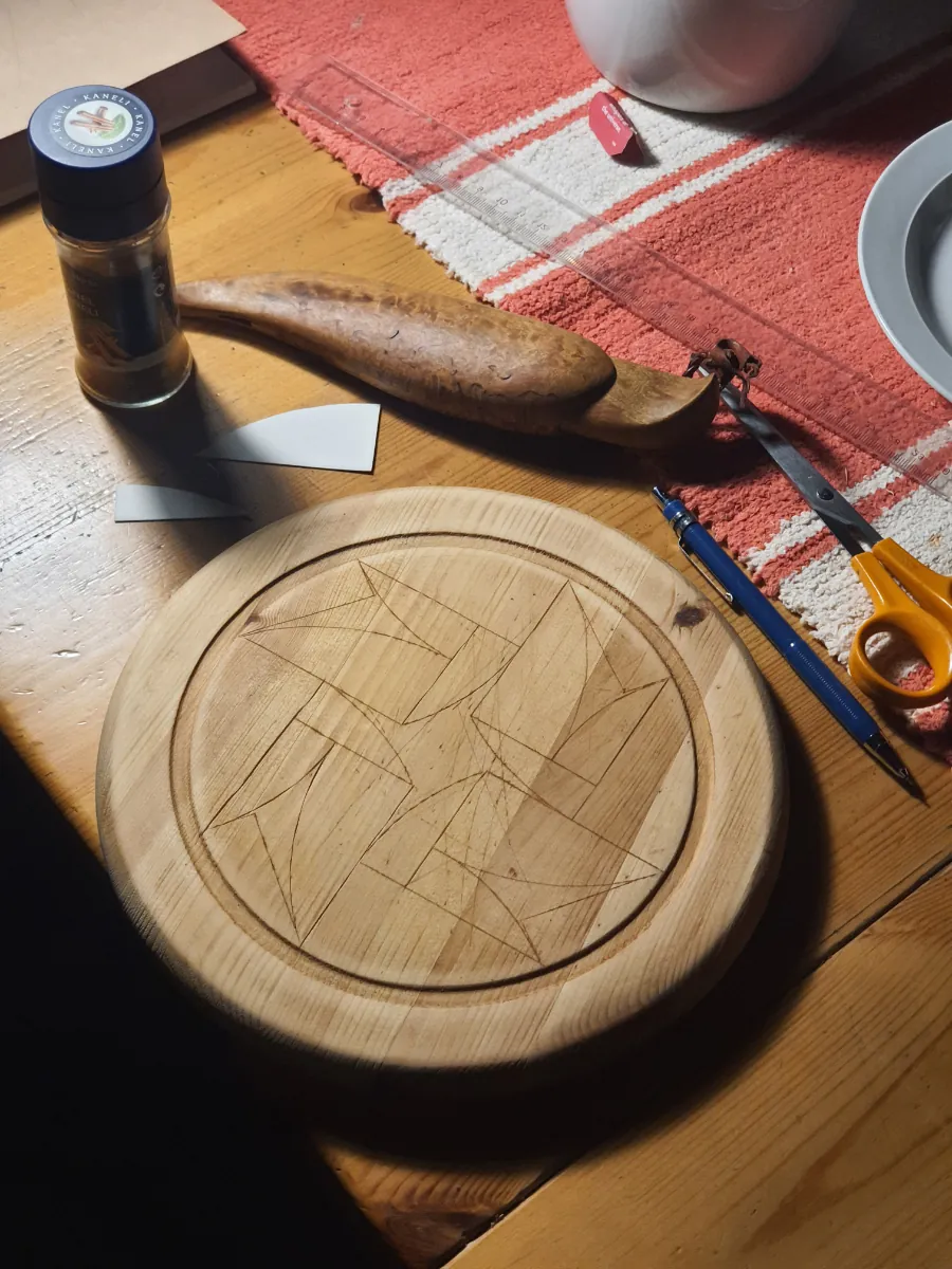
I used one of these to attempt some kohlrosing on an old cheese platter I had. The wood (pine) and tools (dull knife & carboard guides) weren't the best for this, but it's a decent first try! I used cinnamon to fill in the lines.
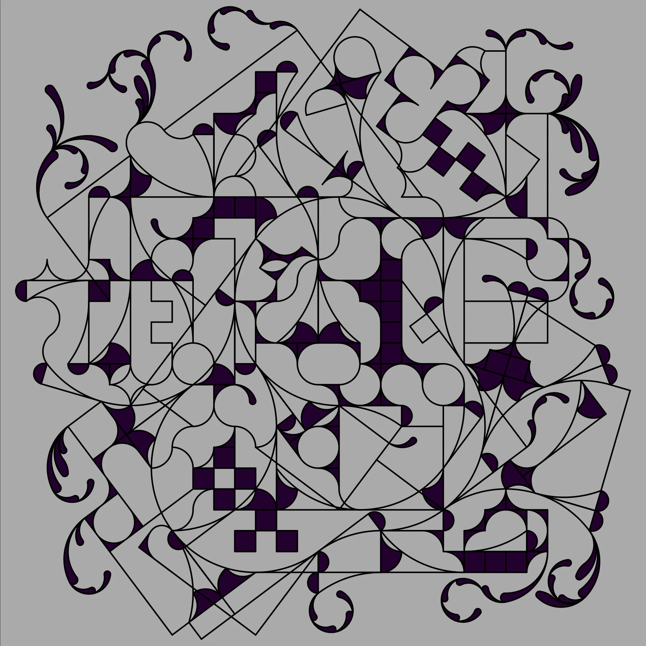
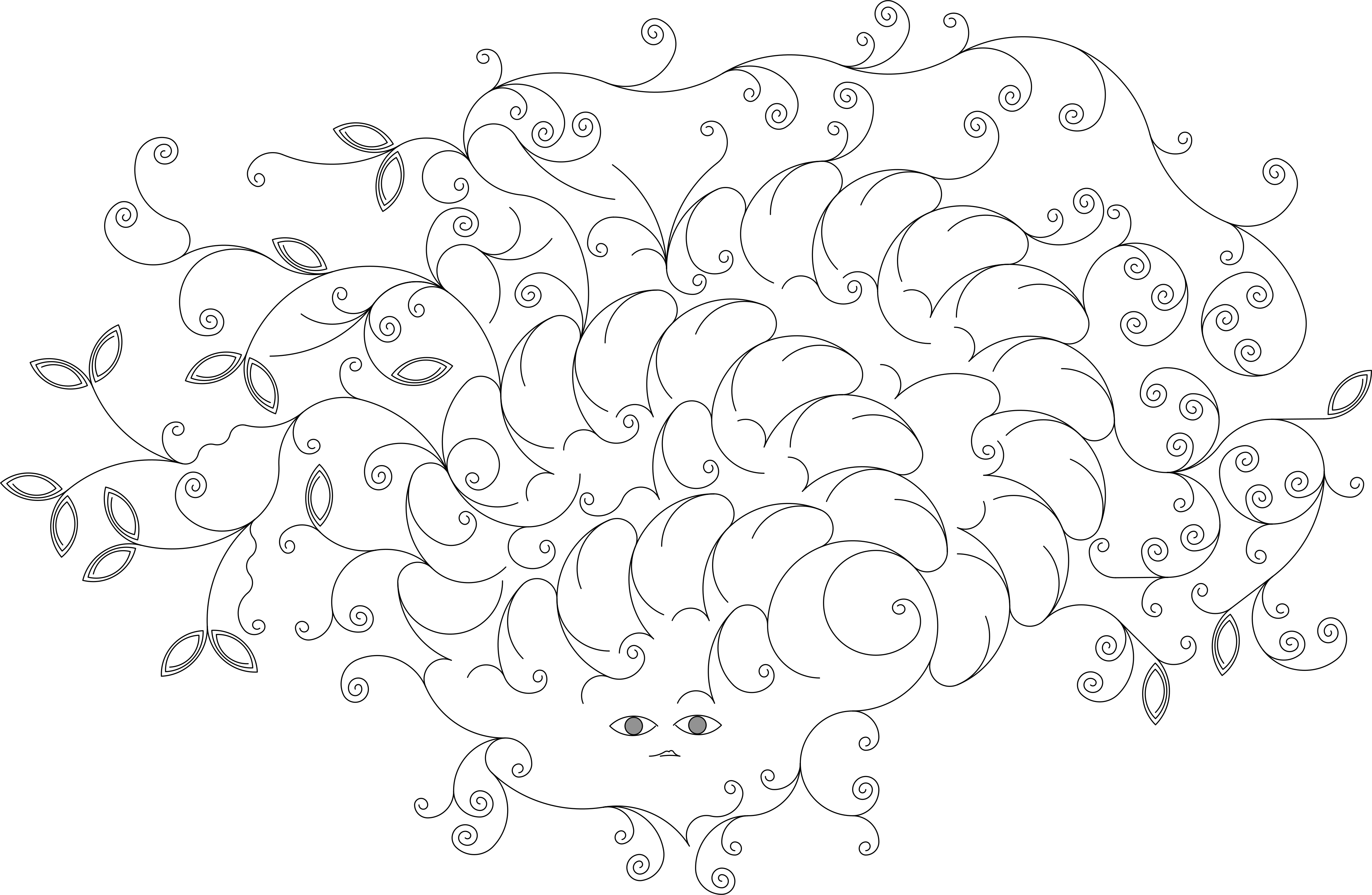
M.C. Escher called his tilings "a game of dividing the plane" and "an extremely absorbing activity, a real mania to which I have become addicted, and from which I sometimes find it hard to tear myself away." I feel the same way with this! And I feel like I've just scratched the surface with what can be done with this editor. That said, even though the highly systematic 3-4-5 arc shapes are fun and addicting, I think the more asymmetric wild ones are ultimately more interesting to look at:
Unfortunately I don't have time at the moment to finish and publish the editor – that will have to happen sometime later. This will also (most probably) be my last post as far as residency projects goes, as I start a new job teaching at Aalto tomorrow! It's a one year temp position, but it'll surely keep me super busy for the next year. On the other hand, I will still be very close to the Centre for Text Margins, and will at least be updating the Centre's website (it's even in my contract!). I will however try to post one more entry reflecting on the residency year as a whole.
In the meanwhile, I warmly welcome So-Hyun Bae as the next resident, starting in a few weeks! I'm very excited to see what she'll work on. Her brother's reading of her trilingual writing text was one of the most beautiful works I've seen in years.