On making a zine entirely with my own tools: a single-stroke Hershey font, a shape-based kerning and semi-justified layout engine and an HTML/CSS-grid page editor.
In May I also completed a milestone in my quest to make a book where I design everything myself. I made a zine, a proof of concept that it is not only possible, but also results in an interesting design. That is the ultimate goal with my tool-making & design practice.
Here's the brief overview of how I made it:
So, overall, every single step in the process from design to print is fully custom, made with my own tools. This is just a test zine, but I hope to eventually make a whole book.
I'll go more into the technical details below, but before that, here's the printed & scanned result:
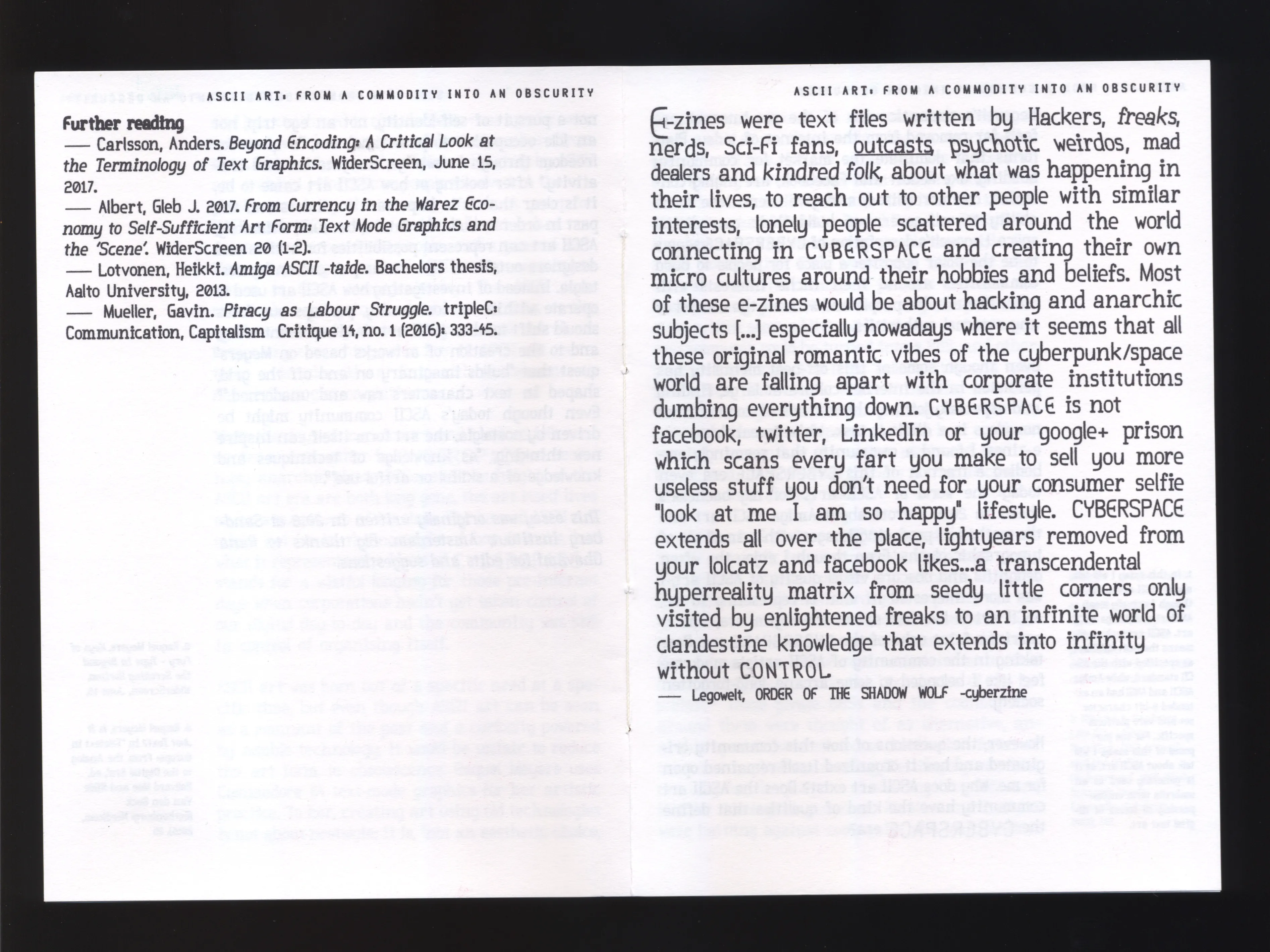
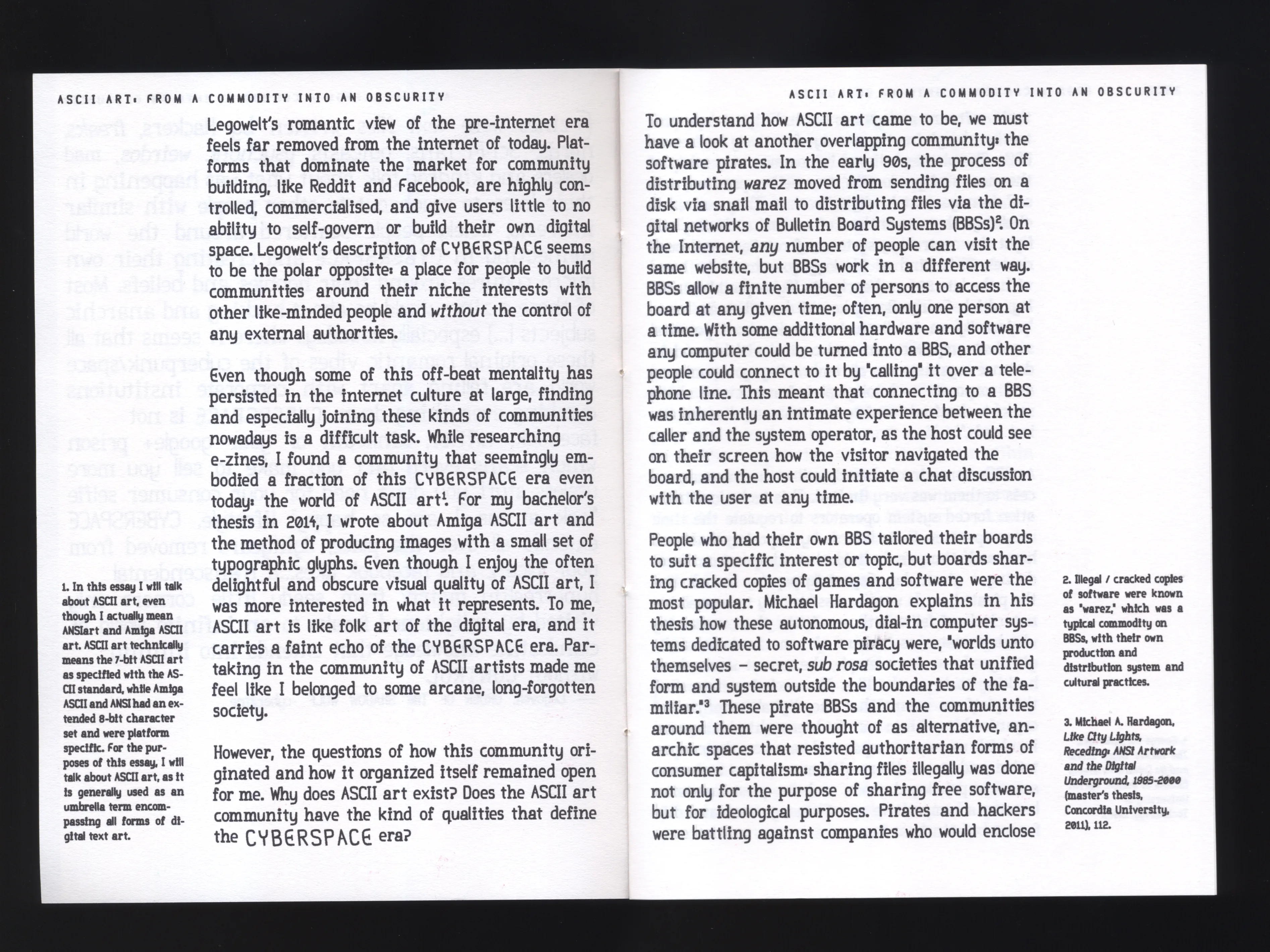
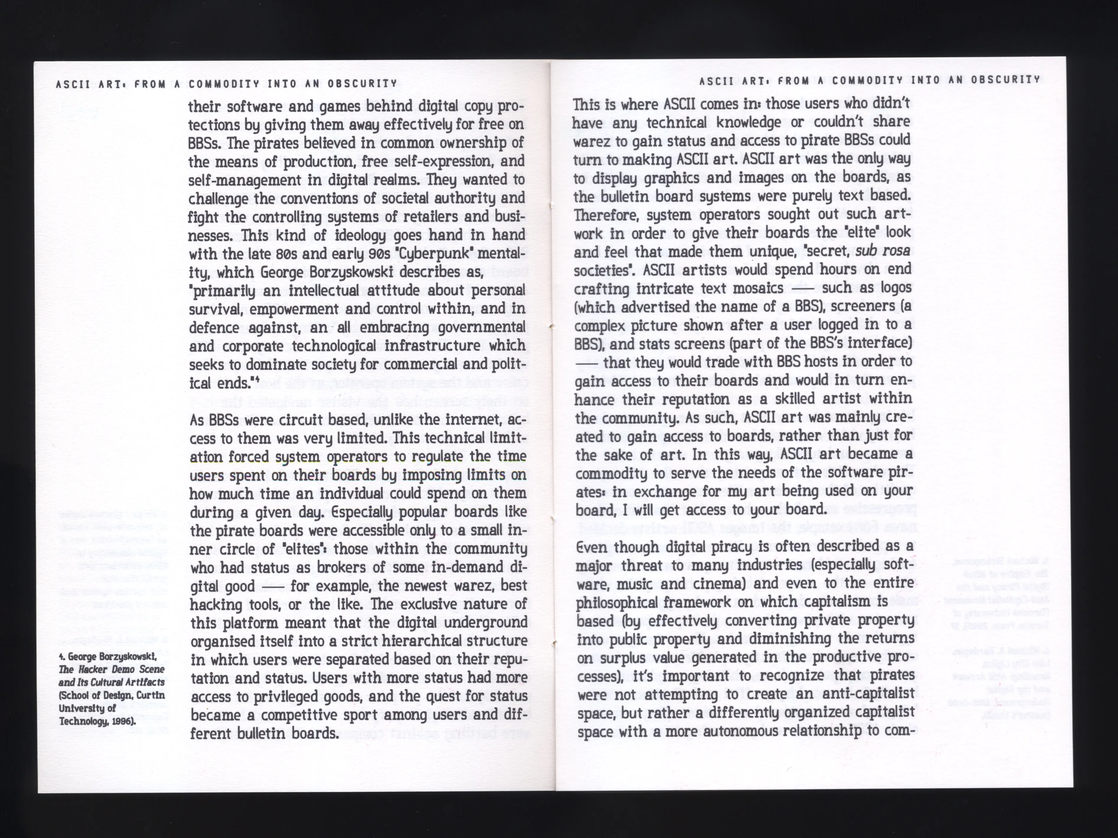

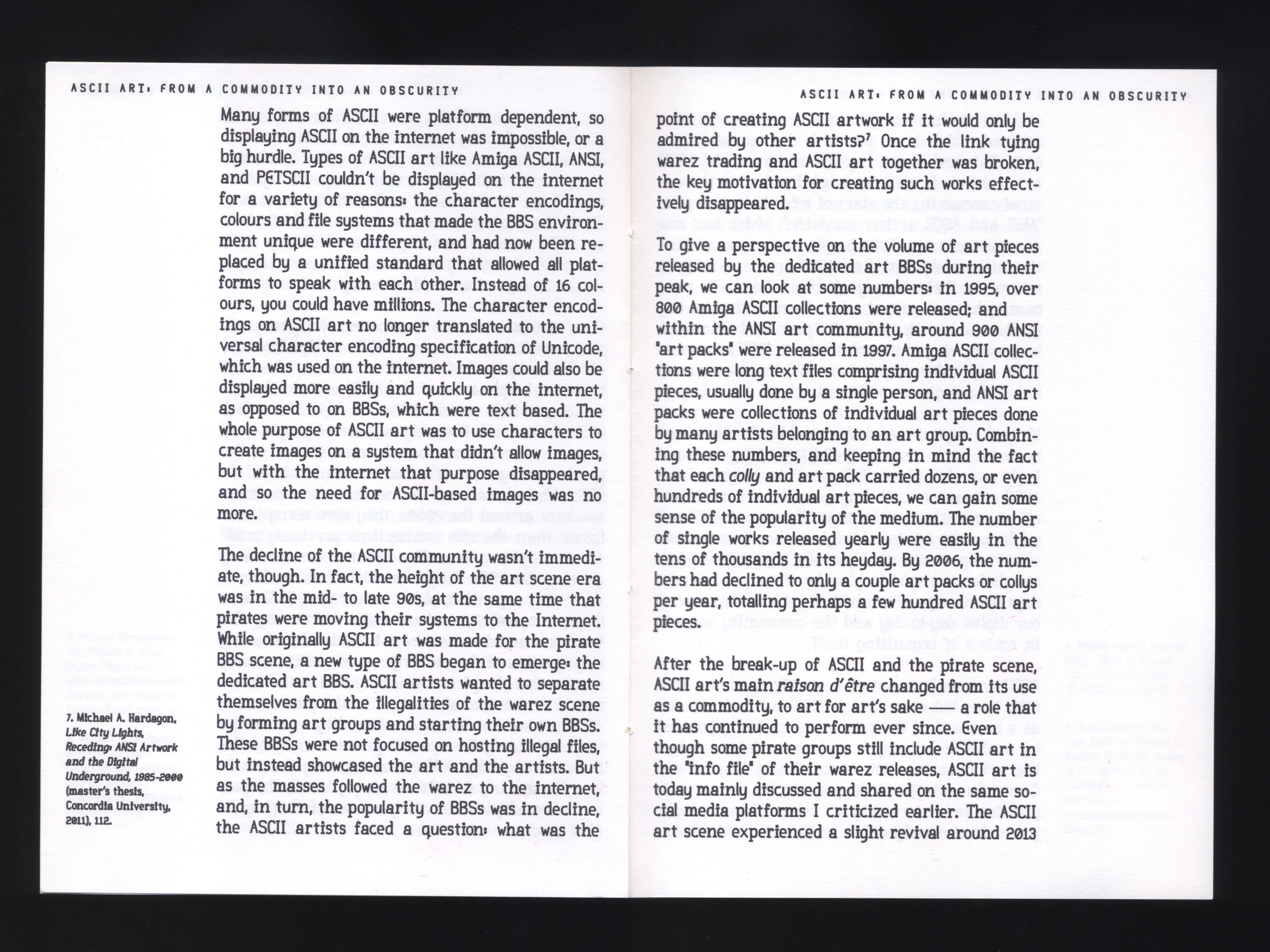
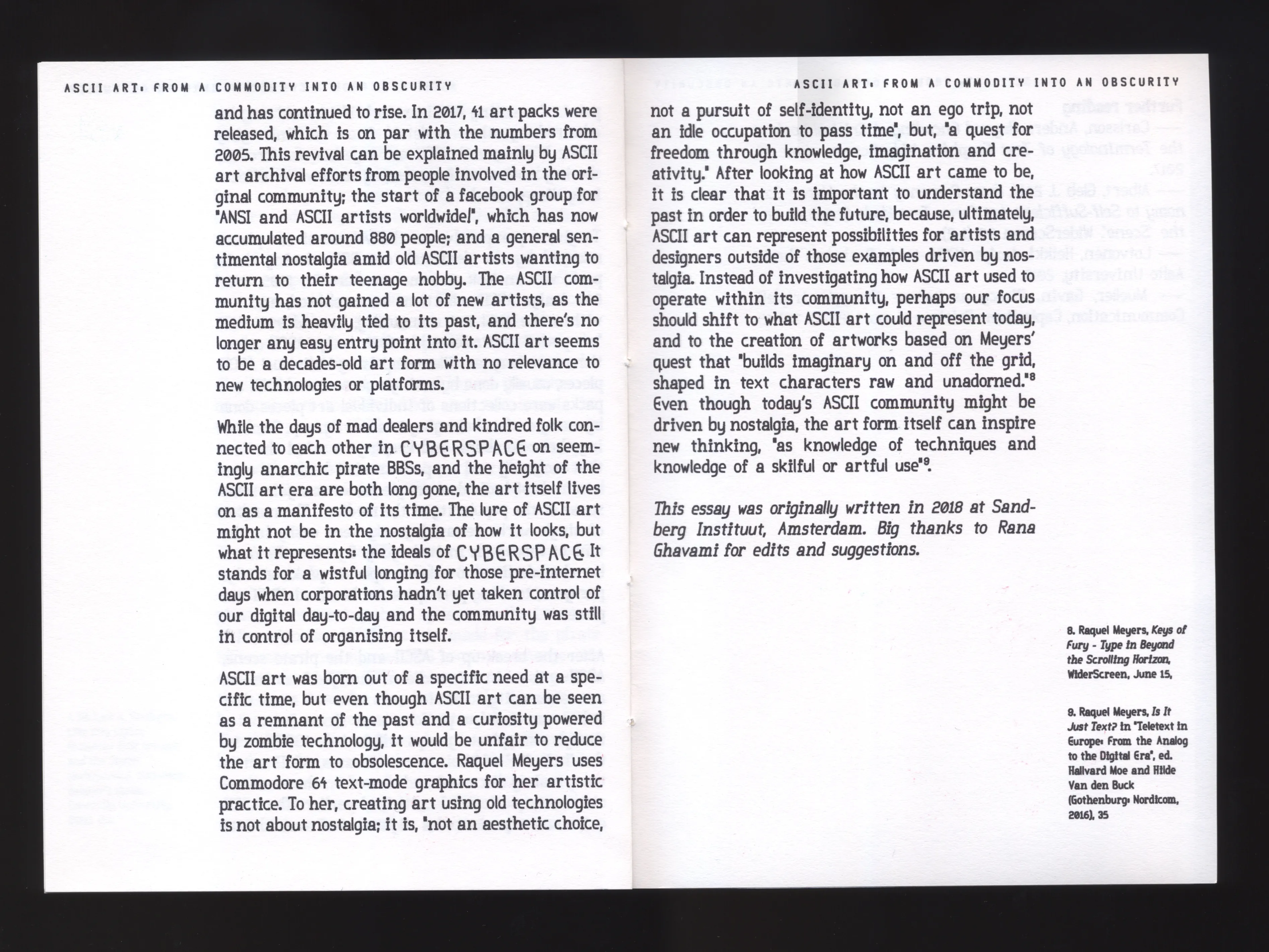
This is going to be very technical, so feel free to skip reading this.
There are four main parts to this system:
In terms of files, it's:
index.html         // the layout (as HTML!)
demo-longtext2.css // styling for layout & print

flow-frame.js      // threaded multi-column text chain
(semi-text.js)     // optional self-contained text block

text-engine.js     // curve math, SVG export, glyph layout
semi-justify.js    // line-breaking / justification engine
hyphenation.js     // Hypher + en-GB hyphenation patterns

duplex4.json       // glyph commands
demo-longtext.txt  // the text that gets flowed
The font is made in my Hershey font editor, which I already introduced in my November and February entries, so I won't go into detail how it works. In short, I make my font in the editor, then save it as json and add it to the zine project folder.
The font (duplex4.json) stores each glyph as an array of drawing commands (moveTo, lineTo, closePath, conicTo, arcTo) in a coarse grid.
For this zine's font (which I made in a few afternoons, so it's not super polished) I used mostly G-conic curves (rational quadratic Béziers) that are parameterized by a "sharpness" value. SVG has no such G-conic primitive, so when rendering the shapes as SVG, each G-conic is converted into one or more cubic Béziers:
I wrote about G-conics in November, but as a summary:
A arcs. Circle centre/radius is calculated from a start point, end point, and a start-tangent angle by intersecting the two perpendicular-bisector lines. I wrote about this in February.
So, each glyph becomes an SVG <symbol>, generated once and cached. Rendered text is then just a bunch of <use href="#letter-…"> references.
Here's a detail view of the letter "a". Zoomed in it looks strange, but when I make the font size small, stroke it, then print it with an inkjet (and the ink spreads a bit), the result is very readable!

And here is the same "a" as seen in the editor:
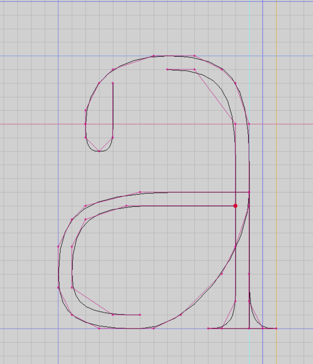
Letters are kerned by the letter's shape (rather than by fixed sidebearing metrics). This avoids the need to do any kerning pairs manually! It works fairly well, but there's room for improvement, especially with letterpairs like "ll", which should have a bit more space around them.
Here's an example with 0 tracking:

The kerning works by flatterning each glyph's curves into line segments, then "scanning" down the em box, finding the rightmost edge of the glyph on the left side, and the leftmost edge of the glyph on the right side. The advance is then the maximum overlap across all scanlines, so an "L" followed by a "T" is closer together than a letter pair like "ll". The maximum is also capped to a percentage of the glyph's width, so for example a dash "—" doesnt go inside a letter "C". The resulting kerning pairs are then cached for faster re-use. (I'll probably work on this more later, it's a bit buggy...)
The semi-justification algo I also covered in the November entry and on my blog, but I improved it a bit after getting inspired by Cheng Lou's fast text measurement & layout library pretext.
Once letters and words are rendered, we know how wide they are: a word's width is the shape-kerned advances of glyphs added up, plus the width of the final glyph. Those widths are fed to the semi-justification engine. Its first step, prepare(text, cacheKey), takes the source text and breaks it into a flat stream of three kinds of items:
\n in the source.
Splitting words into boxes uses Intl.Segmenter for proper word boundaries, and each word is then split further at the soft hyphens inserted by the hyphenation step. A long word like [pro][duc][tion] becomes three boxes, each a possible break point. The measuring of every box is slow, so prepare runs once per text and its result is cached. When a text block is resized, this phase doesn't run again.
Then (idea stolen from Cheng Lou's pretext), layout(prepared, opts) breaks the text into lines using fast arithmetic calculations. It takes the item stream of word boundaries, and adds them to the current row of text until the next word-box doesn't fit, then starts a new line. When a box doesn't fit, it has three options, in order:
But unlike conventional greedy justification that calculates inter-word gaps with normal spaces, with my semi-justification algo each word gap is calculated with minSpace, the minimum allowed inter-word space. This lets the line breaker pack the maximum amount of words onto a line, that can then be justified by widening their spaces. A tighter minSpace means more words per line and denser justification.
Once a line is filled with boxes, the engine decides whether to justify it. It calculates what each gap would need to stretch the line out to the full column width: (column width − total box width) / number of gaps. If that space is below maxSpace (the maximum allowed inter-word space) limit, the line is justified and the gaps are widened to fill the text box width. If the line would need more than maxSpace, i.e. filling the line would leave ugly large gaps, the line is left ragged at its normal space instead. The last line of a paragraph is never justified.
Soft-hyphens are inserted to words beforehand by an embedded copy of Hypher, which implements Knuth & Liang's TeX hyphenation algorithm. A bunch of en-GB hyphenation patterns are used to score every position between letters, and the odd-scored positions are the break points that get added (with a minimum number of letters kept on each side).
A custom element <flow-frame> is used to flow a source text (from a .txt file) between elements. The math is similiar to all the previous measurings: each flow-frame fills as many lines as possible to fit its own height, then the next frame continues where the last stopped.
Here's the HTML for the first frame, that renders the cover Legowelt quote:
<flow-frame
charset="duplex4.json"
text="demo-longtext.txt"
size="11"
line-height="25"
tracking="5"
stroke-width="1"
normal-space="12"
min-space-percent="-25"
max-space-percent="50"
padding="5"
hyphenate="false"
></flow-frame>
There frames are not linked explicitly, but (at the moment) their order in the HTML determines the flow direction. The first frame in the chain has to have the font and the source text as attributes, and every subsequent frame continues rendering using that source and font.
So, the next frame (text that continues on page 1) is just:
<flow-frame
size="8"
line-height="20"
tracking="6"
stroke-width="1"
padding="5"
normal-space="9"
min-space-percent="-25"
max-space-percent="50"
hyphenate="true"
></flow-frame>
Because the frames belong to one continuous text flow, a change anywhere re-flows the whole chain. I haven't tested this with longer texts, but my 19k word essay takes about 50ms to re-flow. I've tried optimizing it, and although it's not great, it's good enough for now. But for longer texts I need to figure out a faster solution. If I were to switch to a conventional font rendering and HTML rendering, it could be super fast (as demonstrated by pretext and other projects like it).
The text itself comes from an ordinary plain .txt file. As mentioned earlier, this source text is passed as an attribute to the first <flow-frame>. The file is fetched once and then shared as a continuous stream between every frame in the chain.
Of course plain text isn't quite enough for proper typography, so the source supports a bbcode-like tiny inline markup, written as square-bracket tags that wrap a span of text:
[b=1.5]bolder stroke[/b]      // stroke weight
[i=10]slanted[/i]             // skew (italic), degrees
[size=20]big[/size]           // glyph size
[r=-5]rotated[/r]             // rotation, degrees
[u=2,1]underlined[/u]         // underline (offset, thickness)
[offset=0,2]nudged[/offset]   // shift x,y
[tracking=10]l o o s e[/tracking] // letter-spacing
[color=red]tinted[/color]     // colour
[3]                           // custom spacing
I used this to add the effects to the text on the cover page: Hackers, [r=10]freaks[/r], n[3][offset=0,2]e[/offset][3]r[3][offset=0,2]d[/offset][3]s, Sci-Fi fans, [u=2,1]outcasts[/u], [i=10]psychotic[/i] [i=10]weirdos[/i][5], [size=10]mad[/size] [size=10]dealers[/size] and [i=-5]kindred[/i] [i=-5]folk[/i]
These also nest, like so: [offset=0,2][tracking=10][size=10][r=-5]CYBERSPACE[/r][/size][/tracking][/offset].
These markups are parsed and turned into single invisible marker characters (from Unicode's private-use range) that work as lookup keys for the renderer; as it processes the text, it applies whatever style the most recent marker assigned.
I've talked about this system previously in October, January and March entries for making UI's for my tools, but it works wonderfully for any general layout too! I used it for the ASCII ART as DESIGN PRACTICE poster, and I used it for this zine.
So, each page is a grid-system. This HTML renders the first page:
<section> //page starts
  <grid-system style="--columns:24;--rows:41;"> //the grid
    <cell style="--pos: 2 / 8 / 3 / 24;"> //first element
      <semi-text
        size="5"
        tracking="20"
        stroke-width="1"
        normal-space="12"
        min-space-percent="-25"
        max-space-percent="50"
        padding="2"
        hyphenate="false"
      >
        ASCII ART: FROM A COMMODITY INTO AN OBSCURITY
      </semi-text>
    </cell>
    <cell style="--pos: 3 / 2 / 34 / 24;"> //second element (flow frame)
      <flow-frame
        charset="duplex4.json"
        text="demo-longtext.txt"
        size="11"
        line-height="25"
        tracking="5"
        stroke-width="1"
        normal-space="12"
        min-space-percent="-25"
        max-space-percent="50"
        padding="5"
        hyphenate="false"
      ></flow-frame>
    </cell>
  </grid-system>
</section> //page ends
Which results in this (the page on the right / cover):
The CSS for the grid system is also wonderfully simple:
grid-system {
  display: grid;
  width:100%;
  height:100%;
  grid-template-columns: repeat(var(--columns, 50), minmax(0, 1fr));
  grid-template-rows: repeat(var(--rows, 50), minmax(0, 1fr));
  container-type: size;
  cell {
    grid-area: var(--pos);
    z-index:var(--layer);
    container-type: size;
    position: relative;
  }
}
So, what this CSS does, is it subdivides a <grid-system> element (it's just a custom named element, not a web component) into 24x41 grid, changeable with CSS variables. Then each <cell> (again, a custom named element, not a component) has a coordinate and size such as <cell style="--pos: 3 / 2 / 34 / 24;">, and that's it.
What is hard and tedious to do manually by hand, is figuring out the coordinate and position, so that's why I've made Grid Drawing Club, a WYSIWYG tool for resizing & positioning the cells. All the Grid Drawing Club does, is edit the source HTML file (moving the elements in the editor changes the <cell>'s --pos variable).
And that's it...! A <flow-frame>, then, is just a "regular" old HTML element inside a <cell> whose --pos: 3 / 2 / 34 / 24; places it on the grid. When the user drags that cell wider, the cell's container changes size, the <flow-frame> inside it re-flows the threaded chain.
Unfortunately I can't share Grid Drawing Club quite yet, I'm still developing it, but here's a screen recording of how it works:
So, in practice:
<section>s as I want my zine to have pages. <grid-system> to each page. <cell>s (or I can add them in the HTML).<flow-frame> element inside the <cell>, and configure the source text file as an attribute<flow-frame> attributes and the bbcode-like markup in the .txt file)The result is a basic static webpage that you can browse below or here.
Turning this into a printable PDF is simple: it's generated by the browser, using @media print rules for CSS. In Firefox I just go File->Print->Save to PDF. The CSS to make it happen is very simple:
grid-system {
  width:148mm;
  height:210mm;
}
@media print {
  @page {
    size: A5 portrait;
  }
}
There was one more hitch before being able to turn it into an actual printed zine. The resulting PDF is single-paged, in reading oreder. I need a A4 booklet, with paged imposed in the right order, so that I can print it using my office printer.
For this I made a small utility to turn a single-paged A5 PDF into A4 ready-to-print booklet PDF. For this I used pdf-lib. I just upload my A5 pdf to the utility and download the A4 booklet PDF, which I can then finally use to print the zine.
There's still a lot of improvements to make, but I'm super happy that I have all the pieces needed now for being able to produce printed matter, all with my own tools, without using Adobe for anything.
But this is all still very much work-in-progress, so I don't wanna share anything super publicly. But, if you want to, you can download the project files from here. Note that it doesn't come with my layout tool, Grid Drawing Club, but it's not really "needed" anyway; the cell coordinates can be edited by hand in code.