Reflections on the residency year: how single stroke fonts, polycentric arcs and a collection of type pictures grew into a toolchain for making a book from scratch, what I'm working on now, and a tally of everything I did.
The residency year is "over", and I figured I'd do a bit of reflection on how it went and what I ended up doing.
I think the residency was extra-special in how it started: it was in Fall 2024 when Arja asked me if I would be interested in being the first resident at this Centre for Text Margins she was applying funding for. I agreed pretty much immediately, updated my CV and wrote a short BIO to be included in the grant application — and that's it. I think this is the first thing that makes my residency different from most others: I did not have to come up with a plan or write a grant proposal. At first, this uncertainty was slightly unnerving — I felt like I should have some grand plan to execute — and I asked Arja if she'd be interested in hearing my ideas for what to work on, but she made it very clear that she did not want to steer my work into any particular direction (other than to keep it loosely related to the Centre's interests), and that I would be completely free to explore what I wanted. In hindsight, this was important advice (thank you Arja!) because this allowed me to just go where my curiosity took me, without having to worry about where I'd end up or if it amounted to anything interesting. This method of working suits me very well, where I let the process guide me to new and unexpected territories. It's only afterwards — now — that I can package it into a neat body of work and make sense of it. Or, I will try to make sense of it; I feel like almost everything I make is somehow connected, each little thing informing the other, and deciding where to start unraveling it is difficult — it's not a linear this-follows-that, but a big mess of little bits and bops that makes the whole.
The second thing that made my residency special is the timing. It was around December of 2024 when we received the news that the grant was awarded. Therefore I had around 9 months to prepare for the residency, which is a lot more than usual. I mentally started the residency on my own almost immediately after receiving the news of the funding, so when the residency officially started, not a lot changed in how I work. Rather, the residency allowed me to fully focus on what I had already been doing on my own. There were many weeks of completely uninterrupted time, without having to answer any emails, or do anything else but focus deeply on getting stuff done — this was wonderful and I wish it was always like that, and I think it's one of the main benefits of a residency like this. The "productivity gains" from that alone were immense.
During December 2024 and January 2025 I wrote an in-depth article on my blog, The origins of DEL (0x7F) and its Legacy in Amiga ASCII art, which is a micro-history of the character DEL (0x7F) as it appears in Amiga's Topaz font. In this research, I read a lot about early computer history, and about obscure technologies for drawing letters on screen. This led me to the 1967 U.S. Naval Weapons Laboratory document called CALLIGRAPHY FOR COMPUTERS by A.V.Hershey, which described the foundational technology for rendering type in vector CRTs, pen plotters and CNC machines. During the spring me and my friends at GRMMXI started working on the visuals for Ruusut band's new LP. They wanted a more direct, digital imagery, so we figured that these single stroke Hershey fonts, as they are called, could work nicely for the kind of vibe they were going for.
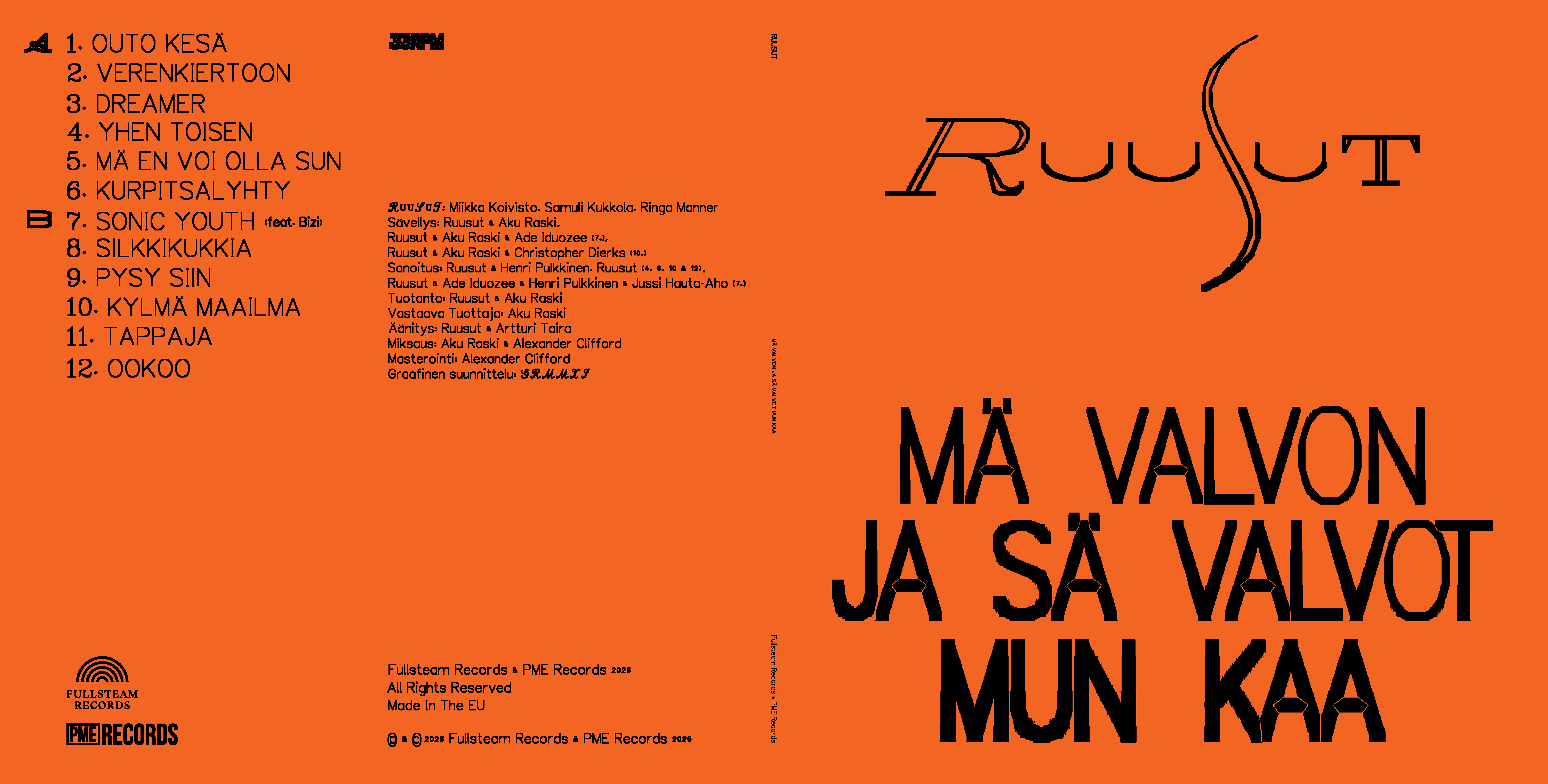
This led to the first overarching thread of the residency — single stroke fonts.
The idea behind single stroke fonts is pretty simple: define the type as an open path, then apply stroke. This means that the letterforms can be infinitely stretched, skewed and rotated without deforming the stroke, because the stroke is applied after transformations. This keeps the typographic color consistent across different type sizes and modifications, so it's "variable" by nature. It also has possible applications in many areas of design, like in rendering text with plotters, laser cutters, CNC-machines etc., but also, as I found out, in UI design. At the beginning of the residency, I combined my earlier modular CSS grid composition tool Grid Drawing Club with a web component <vec-text> that stretches the Hershey skeleton to fill any box, then adds a fixed-width stroke, giving me a really handy UI system that I then used in nearly all of my released editors.
I wrote about this in October.
Then, in November and since, I've been working on my own single stroke font editor that expands on the Hershey fonts by drawing skeletons with not just lines, but also with g-conics and polyarcs. I also added a simple paragraph composer to the editor to get a live preview of text as the font is being drawn.
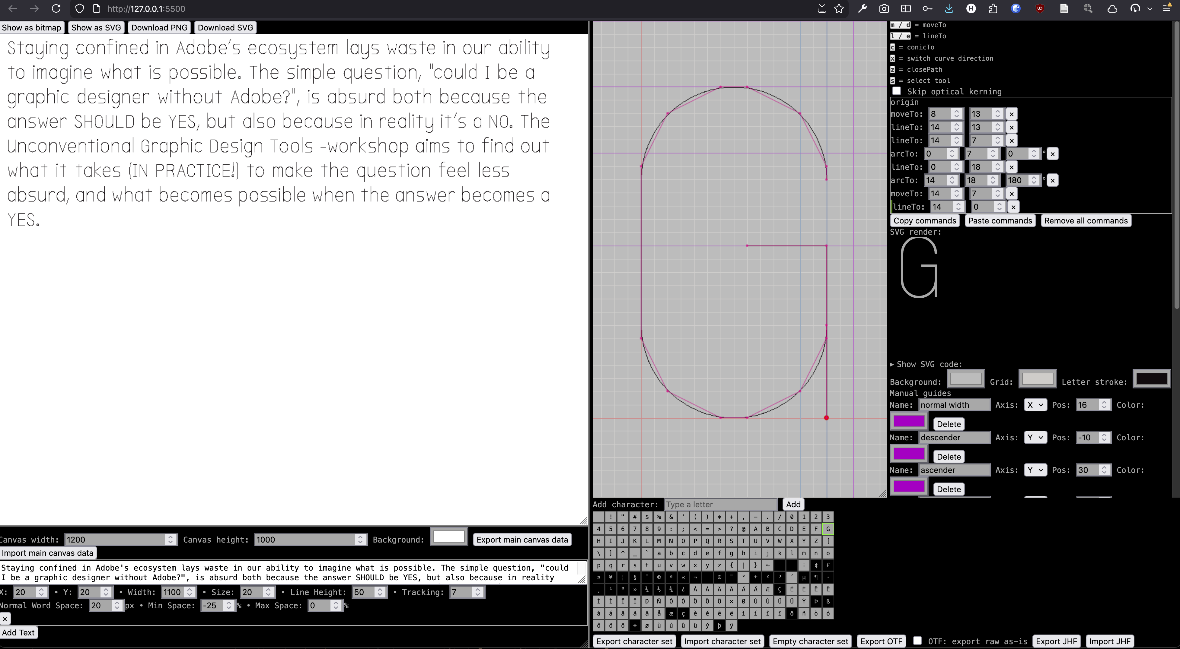
The paragraph composer lays out the text with a method I developed during the summer before the residency, called semi-justification. For it to work properly, I also had to develop a shape-based kerning system, which is another thread that informed my later projects greatly. I also added both vector and bitmap renderers; for the bitmap renderer I developed methods for pixel-fattening strokes, i.e. stroking fonts while maintaining the details (nooks & crannies) of the lettershapes, giving me a full working pipeline for designing bitmap fonts. This came in handy in December when I made Mr. Baby Paint, a radically simple co-op drawing app for toddlers, which includes two bitmap fonts I made with my own editor.
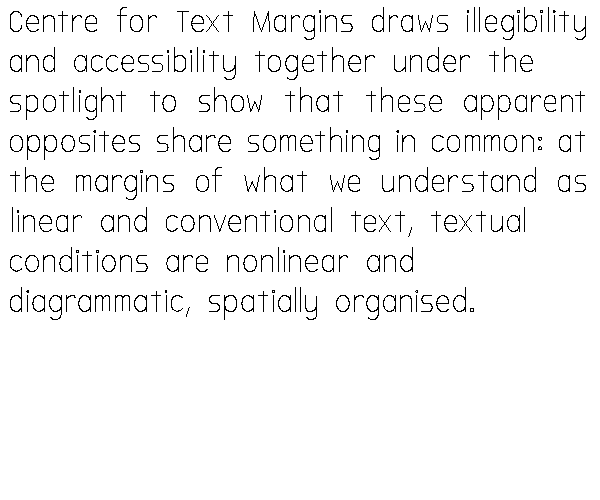
I also used this font editor to make fonts for many other projects during the residency, like the one I made for the Centre for Text Margins.
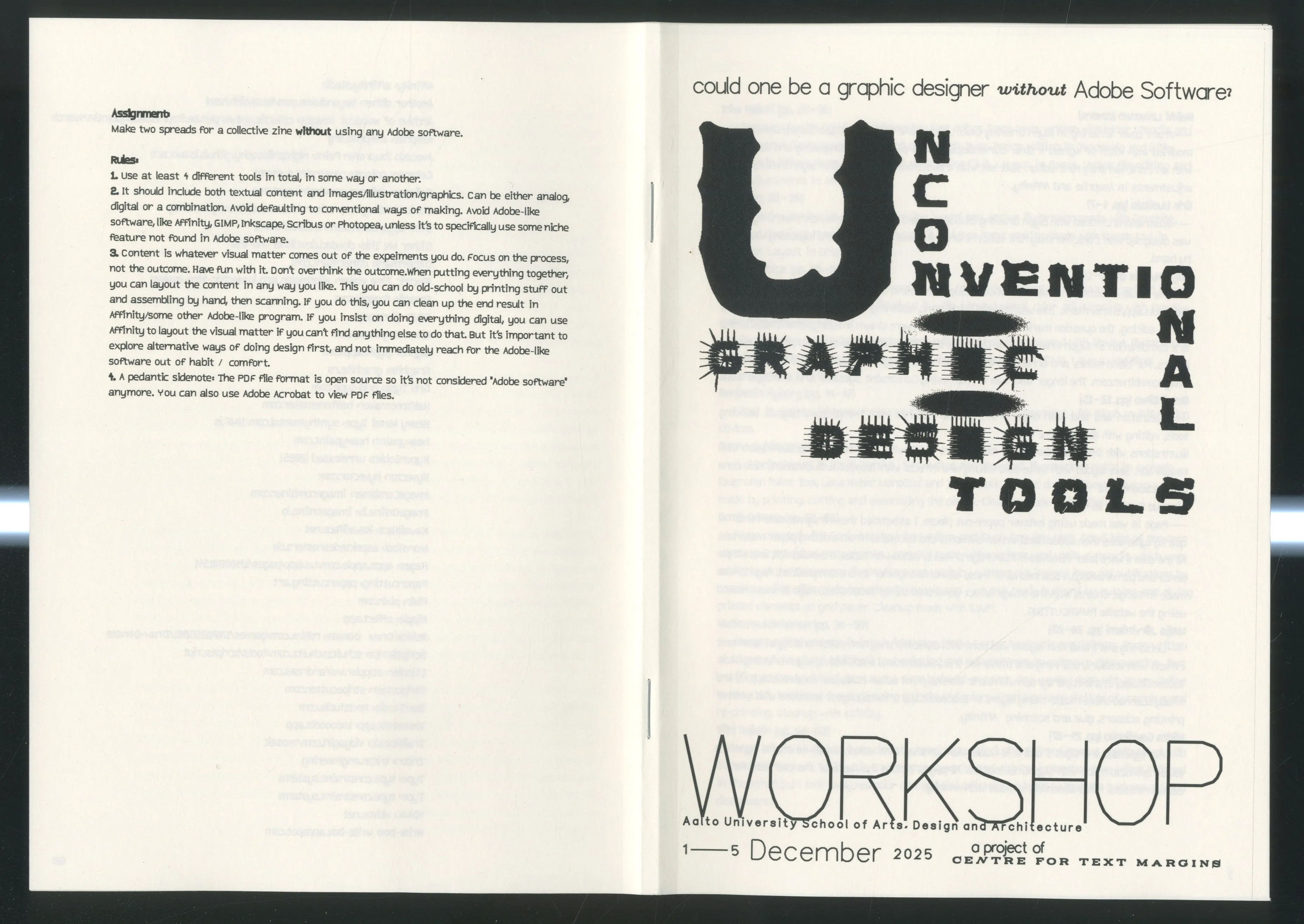
In December I also hosted a week-long workshop at Aalto with the title "Unconventional Graphic Design Tools". The premise was simple: create a zine without using Adobe.
The workshop was a great success, and also made me come up with a more defined goal or question: what would it actually take to design a book without Adobe? If we break down what a book is and reduce it to computational terms, a book is basically just a multidimensional array — a highly organized list of pages containing a highly organized list of words made up of an organized list of strokes, etc. So, a big focus for me was to develop tools specifically for exploring the themes around this, starting from the basics, i.e. how to draw curves, in order to draw letters and graphics. Then, the next focus was using those letters to draw words with proper kerning. Then, one layer above that, is the text alignment, i.e. how to put words next to each other to form paragraphs (which is what my semi-justification algo does). After that, typography & layout, i.e. how to put text boxes, graphics and images together to make a composition (my grid based tools). Then finally, page generation and imposition, i.e. how to actually get a printable PDF out of the previous steps! This all culminated in May when I made a proof-of-concept, a book-like zine made entirely with my own tools.
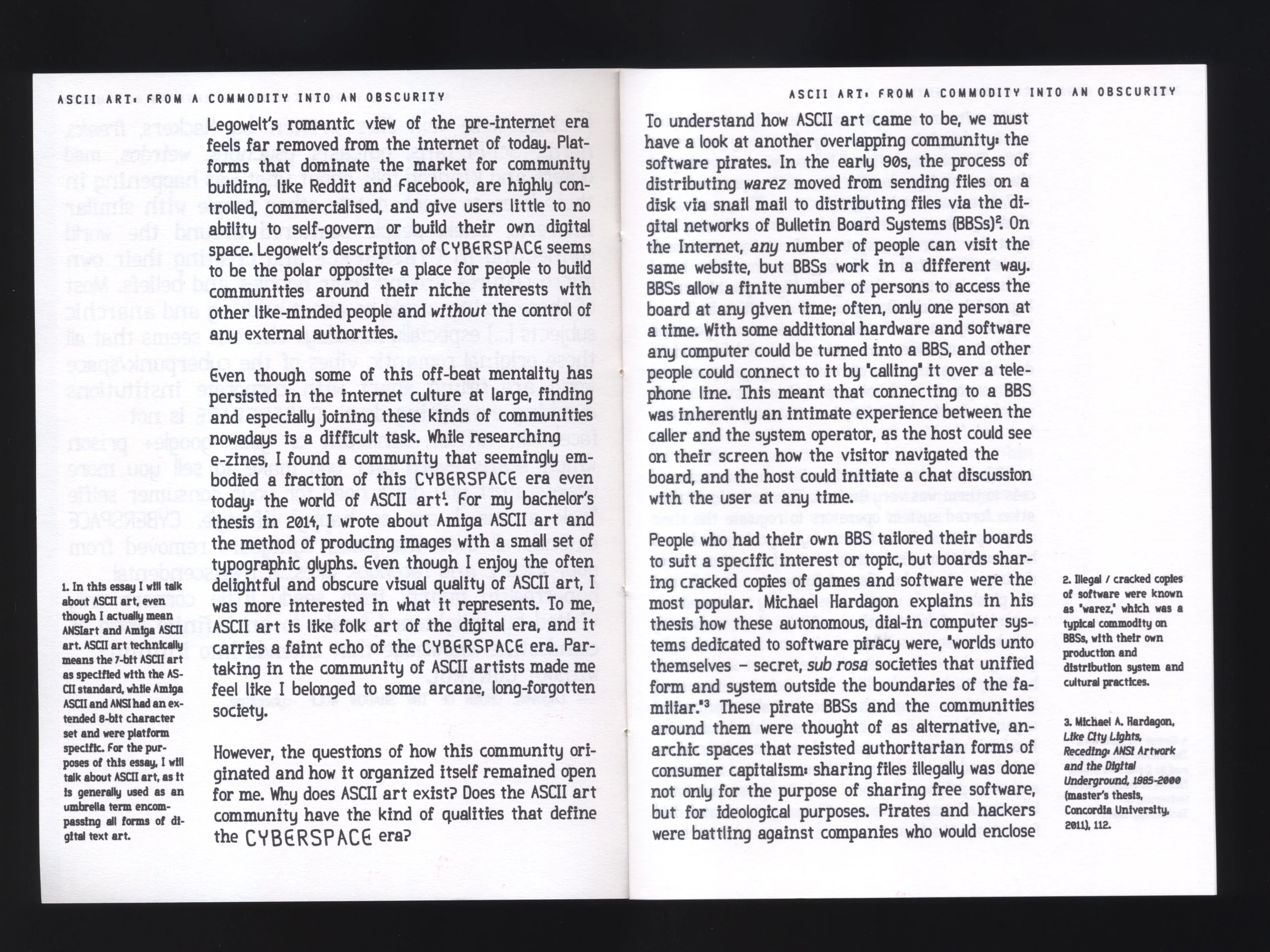
In a sense, I feel like my residency built the foundation for what is yet to come: the next step (at some point) is to actually write and produce a complete book with my own tools.
But all that work left one piece of "how to make a book" missing: the writing itself. The shape-based kerning led me to spend January on building Il–Verse, a spatial writing tool where characters are dropped in cardinal directions that collide based on lettershapes.
This tool is probably closest to the core of the Centre's mission of bringing design and writing, designers and writers, closer to each other. I also used this tool for many of my workshops during the year (Tekstin talo, Basel, If By Magic, Theatre Academy, Lahti, Design as Writing), because it's simple and fast to learn yet always produces some interesting results even for non-designers.

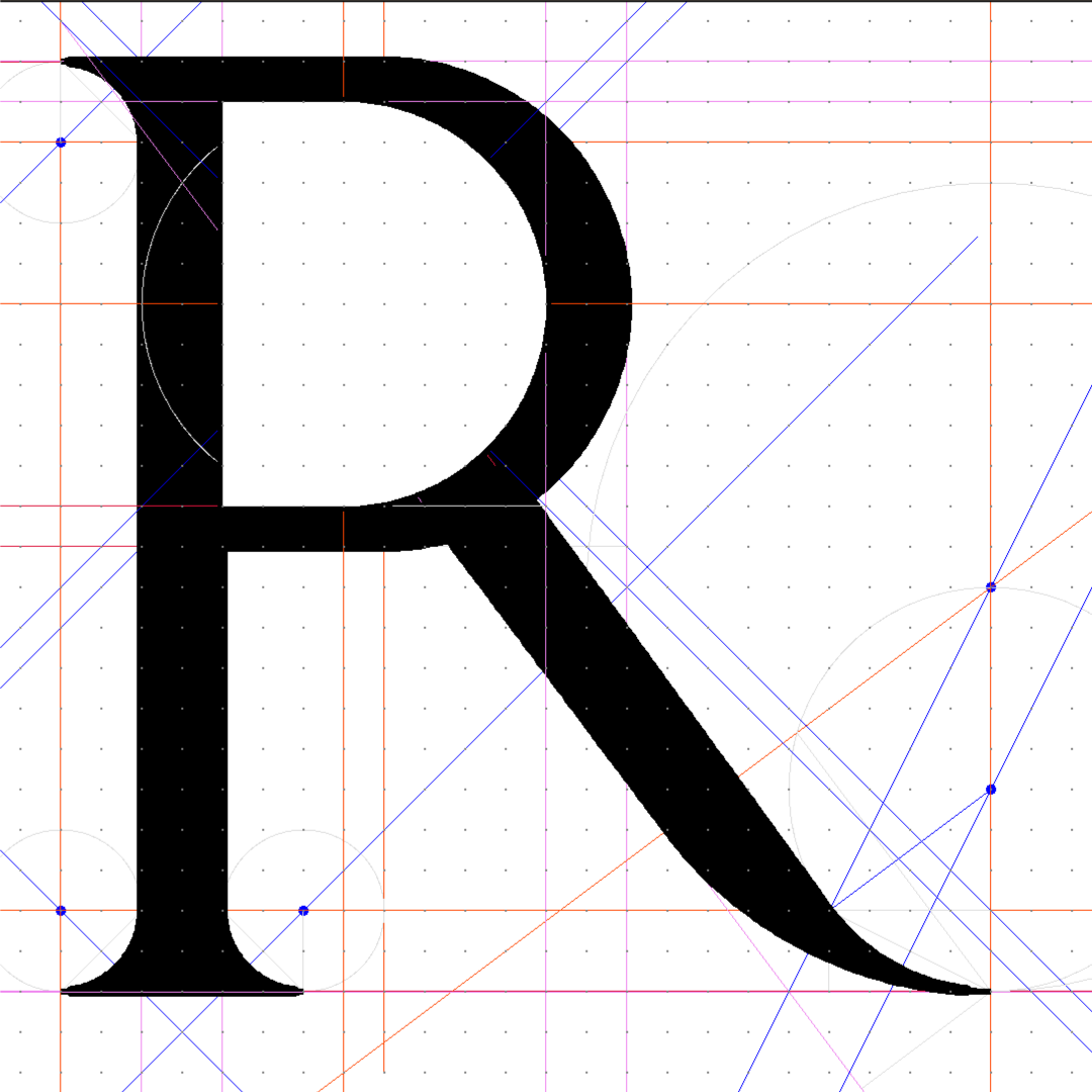
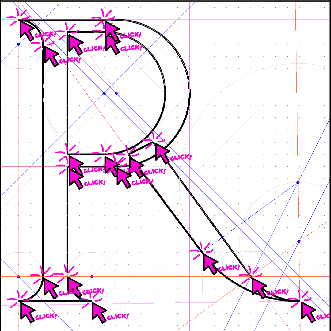
Alongside the book, there's been another connected thread that I've been interested in for years now: how to draw curves. In 2024 I got a small grant from Grafia to develop a tool for drawing with polycentric arcs. Polycentric arcs are curves built by chaining circle arcs together, each one continuing the tangent of the previous one, which makes them surprisingly economical and systematic: a Dürer-style "R" took me only 18 clicks to draw, compared to 233 with Béziers in Glyphs.
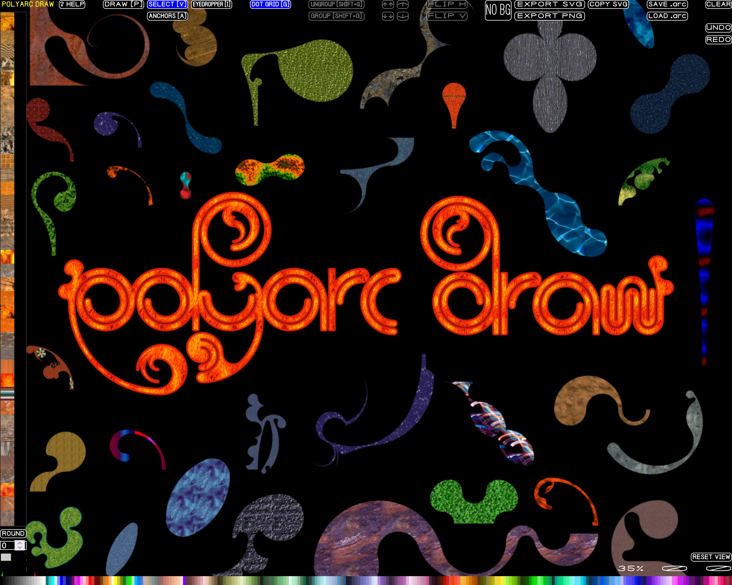
But the polyarcs also create shapes that have a very distinct look. I incorporated this research into many of the tools I built during the residency: you can draw with polyarcs in the font editor, and in two other editors I made: Polyarc Draw.
And Arc Pudding, which is also a more general exploration into translating a traditional compass and rule drawing method into a crazy scriptable plotter-like compass brush:
Then, in August I started yet another editor, a modular vector editor which combines drawing modules with polyarcs and lines, and Glyph Drawing Club -like modular design composition. This is still in development but so far, it's super fun and interesting to play around with.
And then there's the oldest thread of them all: around eight years ago I started collecting specimens of pictorial letterpress — images built entirely out of type, characters, ornaments and rules, which look kind of like ASCII art before ASCII art. There's surprisingly little written about this practice anywhere, so bit by bit the collection has grown into a database of over 2500 images.
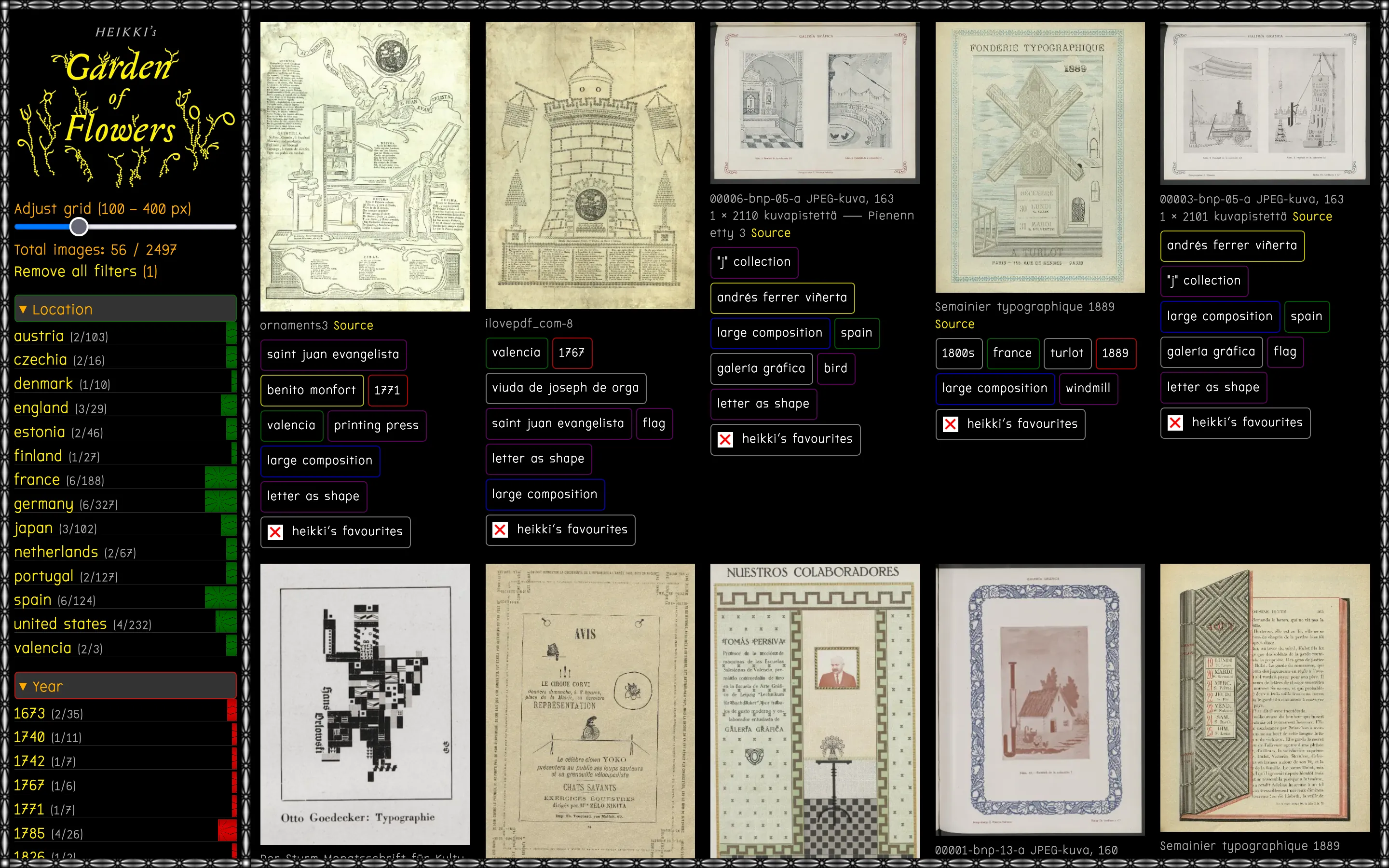
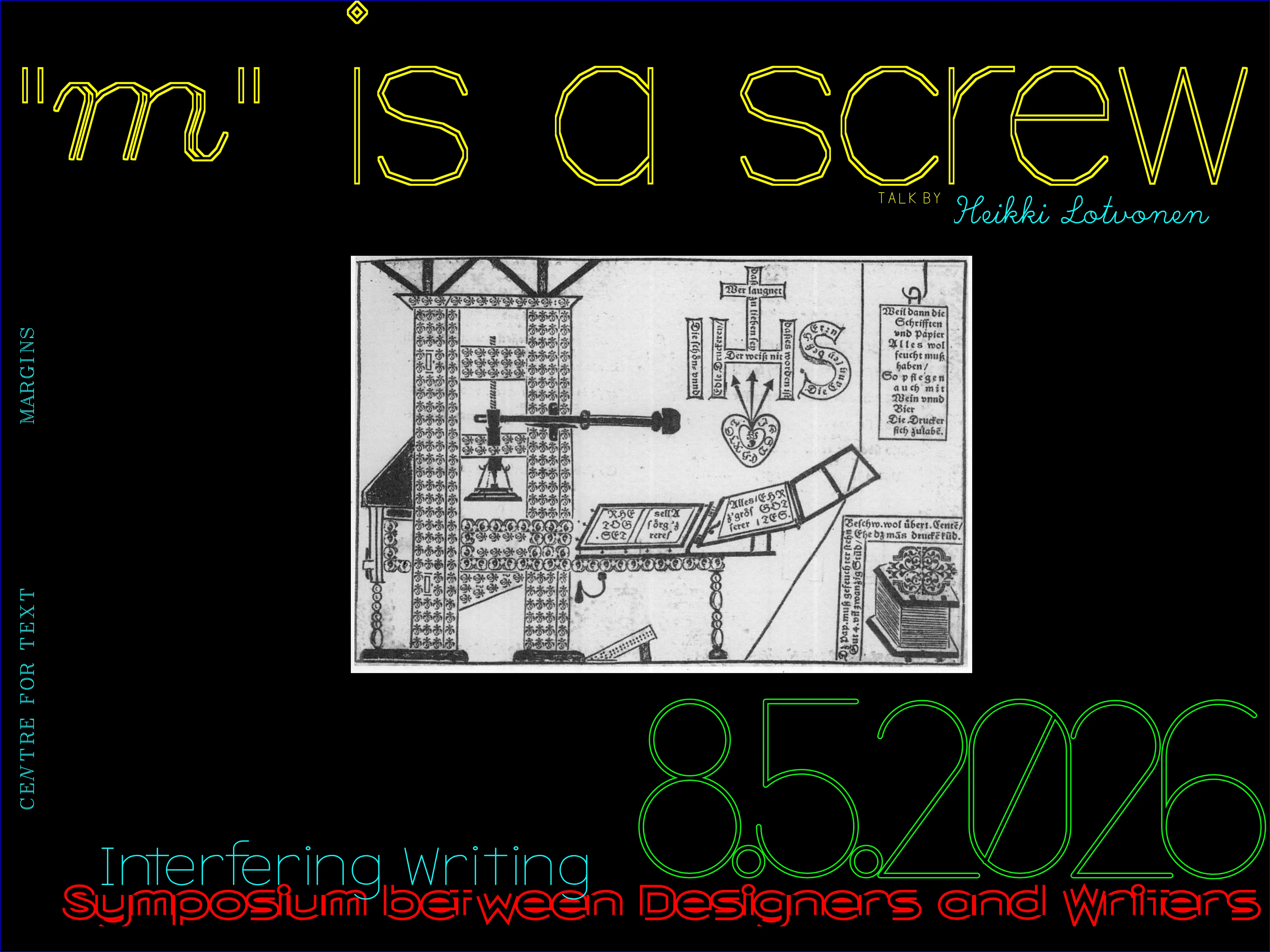
In May, my friend and fellow ASCII artist Adel Faure visited Finland for our joint talk ASCII ART as DESIGN PRACTICE, and while he was here, we turned the offline database I had collected into an archive that is accessible to everyone on the Internet: Heikki's Garden of Flowers. I also gave a talk called "m" is a screw at the Centre's Interfering Writing symposium, which went through the long and strange history of letters used as pictures, all drawn from the collection.
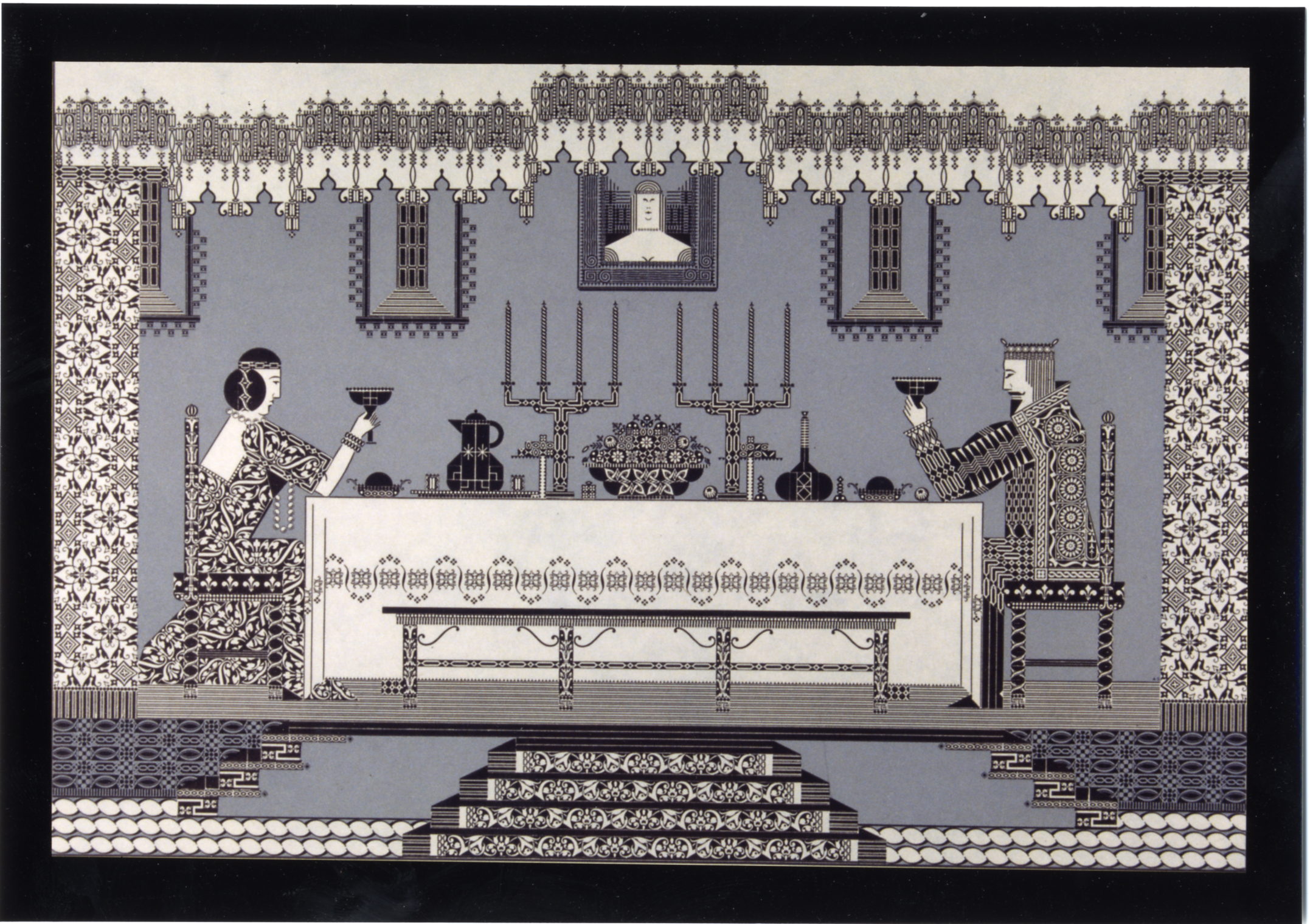
In June, I cleaned up the archive and wrote an essay on how it came to be, and why I think these works have been overlooked for so long. This research is also what led me to start a letterpress simulator in August, which brings me to what I'm doing now.
So, even though the residency ended in August, I haven't really stopped the work. I'm currently working as a teacher at Aalto VCD, but I have enough free time to continue my experiments. For example, during October and November, my plan is to go to Aalto's letterpress studio, print and scan all the type ornaments they have, and incorporate those as little modules in the letterpress simulator. The idea is that students at Aalto can design a complex composition digitally, and then take it to the letterpress studio to recreate it there; making previously unimaginable compositions possible, and saving a lot of time in the composition process, which is especially important because booking longer periods of work time at the studio is often challenging.
The type picture research also took a bit of an unexpected turn: in December I'll be meeting the grandson of Albert Schiller, who wants to meet me about Schiller's artworks. In my Garden of Flowers essay, I quoted Schiller's frustration at being dismissed: "What if I refuse to wait the prescribed 150 years until some custodian now unborn lifts out of obscurity and 'discovers' a musty file of my beloved prints?" I wrote then that my archive aims to be, more or less, that unborn custodian, but I didn't quite expect it to become one so literally.
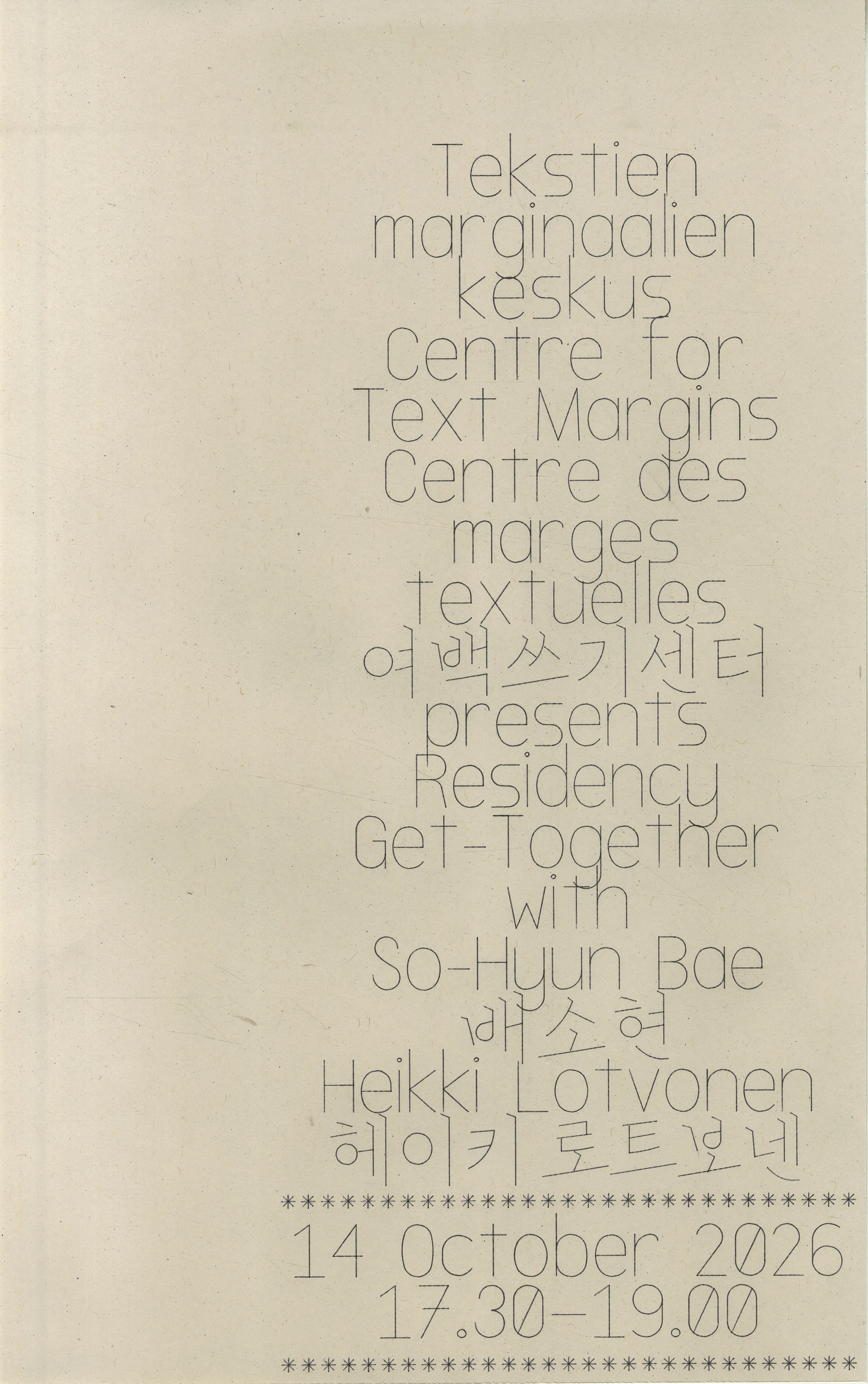
If there's one thing that I failed at doing during my residency is to connect more with the workshops & infrastructe provided by Aalto. So, I'm remedying that now that I'm spending more time physically in Otaniemi: single stroke fonts were originally made for machines that draw with a beam or pen, so me and So-Hyun have been experimenting with plotters (there's at least two at Aalto, we used one at the Aalto Printlab), and we made a poster using the Centre's font, for which So-Hyun drew Hangeul characters.
I also bought an analogue oscilloscope from some student in Otaniemi, so now I can use it as a vector monitor for my font editor.
I've also been testing the same font with laser cutters, which pushed me to add a proper single stroke OTF-SVG export to the font editor.
And the plan is, in the spring, I'll host a single stroke font making workshop at Aalto, where all of the fonts made will be open source and shared. This is maybe what I'm most excited about: the font editor started as a tool just for myself, and now it's becoming something that others can use and build on too. This has real effect for people doing laser cutting too, saving 50% of cutting time if using single stroke fonts compared to traditional outline fonts.
I also finally came up with an interesting idea for a new writing tool, which is what I'm working on now. Recently Fraser Muggeridge sent me an email inquiring about the semi-justification method because he's been researching all kinds of unconventional text alignment methods for his own work and PhD. In a recent article he wrote for the Inscription journal, he mentioned the legendary 1996 Super Metroid FAQ/speed guide, which is a game guide written in a monospaced font, and the whole text is visually justified; not by some algorithm but by the writer, rs1n / Han Duong, carefully choosing words to fit every line with exactly seventy-five characters. This inspired me to start experimenting with a writing tool that forces the writer to choose words to fit the line, but with any font. It works by measuring the width of each word in a dictionary using a specific font, then as the writer writes, recommends words that would complete the line with zero space remaining. Writing this way is very demanding, like a puzzle to be solved, but also very rewarding and satisfying, resulting in exactly the kind of interference I always try to capture: one where the tool shapes the practice, and the practice shapes the tool. It also works surprisingly well in Finnish, because Finnish language has a ton of suffixes and inflections. In total, the Finnish language version can suggest around 3 600 000 distinct word forms, while the English is just around 370 000 words (of which nearly 300,000 are archaic or obscure).
Not everything went where I expected, of course. Hypergoblet, the experimental DTP software I started in my very first month, got stuck because I couldn't get good printouts from it: vector output printed much better, thanks to whatever rasterizing magic happens inside printer drivers. Later, I had some promising results printing at exactly the printer's DPI, so I might return to it at some point. I've also finally started updating Glyph Drawing Club, which I've been meaning to do for years.
Looking back, I think Arja's advice not to make a plan was the best thing that could have happened to this residency. I never had a clear vision of any outcomes, I just followed my curioisty and explored ideas and questions that popped up. And bit by bit, the little demos, experiments, bits and bops have started accumulating and connecting. At the start of the residency, I couldn't have predicted what I would have had at the end of the year.
A huge thank you to Arja for inviting me to this residency and trusting me to find my own way, to Matleena and Aliisa for all the work at the Centre, and of course to the Kone Foundation for funding the residency. Thank you also to Robin Ellis and Ted Davis for inviting me to host workshops. Special thanks to my family for all the love, support and patience. Thank you also to Adel for coming all the way to Finland, and to everyone who came to the workshops and talks, and tried out my tools. And finally, a warm welcome to So-Hyun Bae, the next resident. I can't wait to see what she'll make!
As a final tally of what I managed to do during the year, I made 6 new published tools & editors, 2 updates to old tools, 5 unpublished editors in progress, 34 small tools, demos & experiments, 4 fonts, 12 design artifacts, 8 workshops & teaching sessions (with 60+ workshop participants, 3 talks and 15 blog posts). Here's the full list: